
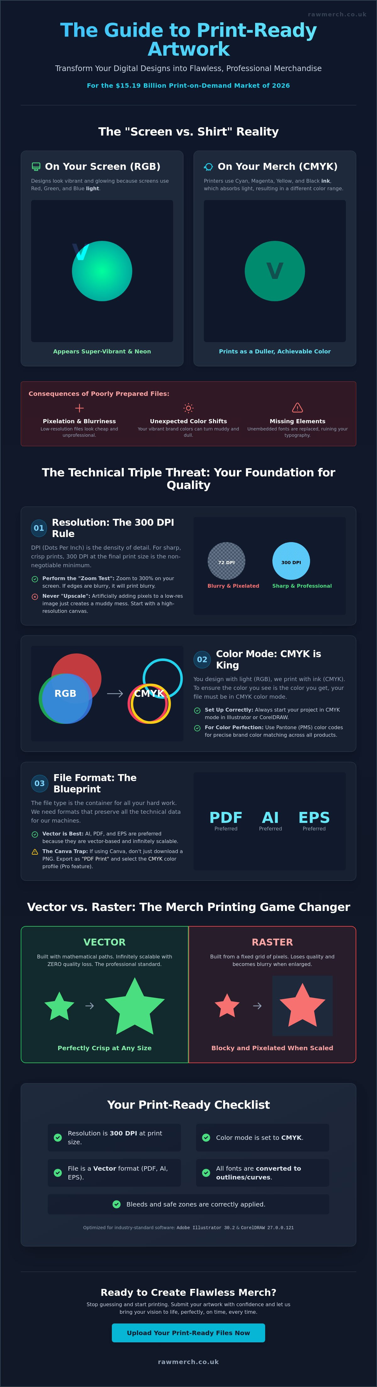
Your design looks incredible on a high-resolution screen, but that doesn't mean it's ready for the press. With the global print-on-demand market hitting $15.19 billion in 2026, the competition is fierce, and a blurry logo is the fastest way to lose a customer. Understanding print-ready artwork is the difference between a professional brand and a wasted investment. You want your merch to look sharp, not pixelated or dull.
We know how frustrating it is to deal with order delays or confusing technical jargon like CMYK and DPI. It's even worse when you receive a box of gear that doesn't match your vision. You've worked hard on your brand, and you deserve a finished product that reflects that effort. We know what you want, and we deliver on time everytime, but that starts with getting your files right before you hit upload.
This guide will teach you exactly how to prepare your designs for professional, high-quality results. We'll break down the requirements for the latest industry tools, including Adobe Illustrator version 30.2 and CorelDRAW version 27.0.0.121. You'll gain the confidence to submit your artwork knowing it meets the highest standards for 2026. Let's get your designs ready for the real world.
Key Takeaways
- Stop guessing if your file will work. Understanding print-ready artwork means submitting files that require zero technical adjustments for a perfect, crisp finish.
- Master the technical triple threat by ensuring every design hits the 300 DPI minimum and uses CMYK color profiles to match your screen to the final product.
- Learn why vector artwork is the ultimate merch printing game changer, allowing you to scale designs to any size without losing a single detail.
- Protect your vision by mastering bleeds, safe zones, and the essential "font rule" to prevent cut-off text or missing graphics on your custom clothing.
What is Print-Ready Artwork? (And Why It Matters)
Print-ready artwork isn't just a digital file that looks good on your phone. It's a file that requires zero technical adjustment before hitting the press. When you send us a design, our job is to bring it to life. However, if that file isn't technically sound, the machines can't read it. At RAW Merch, we've spent over 25 years perfecting the art of custom printing. We've seen every mistake in the book. Understanding print-ready artwork is the first step to ensuring your brand looks exactly how you imagined it.
Your computer monitor is a liar. Screens use RGB light to create colours, while our printers use CMYK ink. This "Screen vs. Shirt" reality is where most projects go wrong. A neon green on your screen might look like a dull olive on a cotton hoodie if the file isn't prepared correctly. We don't want you to be disappointed when you open your delivery. That's why we insist on files that are built for physical production, not just digital display.
Submitting files that aren't ready for the press leads to three things: delays, extra setup fees, and frustration. When a file is broken, our production line stops. We have to contact you, explain the issue, and wait for a fix. This kills your timeline. We know what you want; you want your gear fast and you want it perfect. We deliver on time everytime, but that process starts with a solid foundation. Our team uses our decades of experience to spot "artwork traps" like hidden transparencies or low-res elements before they ever reach the machines.
The Difference Between a Design and Print-Ready Art
A design is your creative vision. It's the "what." Print-ready art is the "how." It's a technical blueprint that tells our machinery exactly where to lay ink and how much to use. This involves specific Prepress processes that clean up your files for the best possible output. If your file doesn't have the right specs, it's just a picture, not a production tool. YOU WANT IT, WE CREATE IT! But we need the right blueprint to make it happen.
Common Consequences of Poorly Prepared Files
- Pixelation: Low-resolution files create a blocky, blurred mess on your custom hoodies. It looks cheap and unprofessional.
- Colour Shifts: Without the right colour profile, your vibrant red logo can easily turn into a muddy brown.
- Missing Elements: If you don't embed your fonts, our system might replace your custom typography with a generic default. Your whole brand identity could disappear in an instant.
The Technical Triple Threat: Resolution, Colour, and Format
Getting your head around the technical side of production is non-negotiable. Understanding print-ready artwork requires a firm grasp of three pillars: resolution, colour mode, and file format. If one of these fails, your custom merchandise won't meet the high standards we set at RAW Merch. We've seen thousands of files over 25 years, and the most common issues always stem from these three areas. You want your brand to stand out, so you need to get the foundation right.
Resolution and the 300 DPI Rule
DPI stands for Dots Per Inch. It's the density of information in your file. For screen printing or DTF, 300 DPI at the actual print size is our minimum requirement. If your logo is 10cm wide on a hoodie, it needs to be 300 DPI at 10cm. A simple "Zoom Test" works wonders. Open your file on a computer and zoom in to 300%. If the edges look jagged or blurry, they'll look even worse on a t-shirt. You can't simply "upscale" a low-res image in software like Photoshop. Adding pixels that weren't there originally just creates a muddy, artificial look that ruins your merchandise.
Colour Models: Getting Your Brand Colours Right
Your screen creates colour by mixing red, green, and blue light (RGB). Our industrial printers mix cyan, magenta, yellow, and black ink (CMYK). This is the primary reason why neon colours often lose their "pop" when printed; they physically cannot be recreated with standard ink. If your brand relies on a specific, exact shade, we recommend Pantone matching. It's the industry's universal language for colour consistency across different fabrics and products. We know what you want, and using the correct colour model ensures we deliver it exactly as you planned.
The "Big Three" file formats in the printing world are PDF, AI, and EPS. These formats hold the technical data needed for precise production. Many creators now use beginner tools like Canva to build their brand. This is a great starting point, but you must avoid the "Canva Trap." Don't just download a standard PNG. You should export your design as "PDF Print" and select the CMYK colour profile if you have the Pro version. This simple step ensures your hard work translates perfectly to the final product. If you're unsure about your file quality, you can always view our product range to see the level of detail we achieve with the right artwork.
High-quality results depend on these technical specs. When you provide a 300 DPI, CMYK file in a professional format, you eliminate the guesswork. This allows us to focus on what we do best: creating high-impact custom clothing that looks incredible. YOU WANT IT, WE CREATE IT! But we need the right technical blueprint to ensure the final result matches your vision perfectly.
Vector vs Raster: The Merch Printing Game Changer
Choosing between vector and raster art is the biggest technical decision you'll make for your custom clothing. Most guides focus on business cards or websites, but printing on fabric is a different beast. Understanding print-ready artwork means knowing which file type suits your chosen printing method. At RAW Merch, we've spent 25 years handling both, and we know that the wrong choice leads to blurry edges or rejected files. You want a professional result, so you need to match your art to the machine.
Vector images are built using mathematical formulas rather than pixels. This makes them the ultimate tool for merchandise. Because they aren't made of dots, you can scale them from a tiny sleeve badge to a massive back-print without losing a single ounce of quality. If you want to Learn more about what is a vector based image, our dedicated guide breaks down why these files are the industry's preferred blueprint. YOU WANT IT, WE CREATE IT! But for the sharpest results, vectors are usually the way to go.
Why Vectors are King for Screen Printing and Embroidery
Vectors provide the clean, hard edges required for high-quality screen printing. When we create screens for your t-shirts, the mesh needs a distinct "on or off" signal for the ink. Vectors deliver this perfectly. They also make colour separation much easier. Since each colour is a distinct mathematical shape, we can separate your design into individual layers for the press in minutes. This efficiency helps us keep our promise: we deliver on time everytime. For embroidery, vectors are essential for digitising. The software needs those clean paths to tell the needle exactly where to move. This ensures your logo looks crisp and stays durable through every wash.
When Raster (High-Res) is Actually Better
Raster art is made of pixels. Think of a photograph or a complex digital painting with thousands of gradients. You can't turn a photo of a sunset into a vector without losing the soul of the image. For these designs, high-resolution raster files are the better choice. This is where modern DTF (Direct to Film) printing shines. DTF can handle the intricate details and millions of colours found in raster files that traditional screen printing might struggle with. However, you must follow the "Transparent Background" rule. JPEGs automatically add a white box around your art, which is useless for merch. Always use a high-res PNG with a transparent background to ensure only your design hits the fabric.
Data shows that products with one design element account for 56% of all print-on-demand sales. These simple, bold designs are almost always best handled as vectors. Whether you are building a streetwear brand or ordering corporate gear, picking the right file type is vital. We know what you want: gear that looks exactly like your mockup. By choosing the right format for your specific printing method, you ensure your vision becomes a high-quality reality.
Mastering the Layout: Bleeds, Safe Zones, and Placement
Designing for merchandise isn't just about the art itself. It is about where that art sits on a physical object. Understanding print-ready artwork means respecting the physical limits of the machinery. Even a perfect design fails if it's cut off by a blade or printed over a bulky seam. We've spent over 25 years ensuring layouts are flawless before they hit the production floor. You want your gear to look professional, and that requires mastering the technical boundaries of the canvas.
Bleed and Trim: Ensuring Edge-to-Edge Perfection
Bleed is the 3mm of extra background that extends past the final cut line. It acts as a safety net. Without it, the slightest shift in the cutting blade creates a "white sliver" along the edge of your stickers or promotional items. This looks amateur and ruins the impact of your brand. In Adobe Illustrator or InDesign, you must set your bleed to 3mm in the Document Setup menu. This ensures your colour runs edge-to-edge every time. We deliver on time everytime, but we need that extra 3mm of "mess" to guarantee a perfect finish on every cut.
The 'Quiet Area' and Safe Zones
The Safe Zone is the space inside the trim line where your critical elements, like text and logos, must stay. Physical movement in the press is a reality of manufacturing. If you place your text exactly on the edge, it will eventually get clipped. For t-shirts, keep your art at least 5cm away from zips and seams. Printing over a seam creates an ink gap that looks like a mistake. For 3D items like mugs, stay 10mm away from the top and bottom edges to ensure the wrap doesn't distort. YOU WANT IT, WE CREATE IT! But we need your help to keep the "quiet area" clear of vital information.
Placement changes the entire vibe of your custom clothing. A 10cm logo looks sharp on a left chest but disappears on a full back. You need to scale your artwork specifically for the location you choose. This is especially true for headwear and accessories. You can see how placement works for custom bobble hats in our dedicated guide. Whether it's a cuff embroidery or a crown patch, the layout must be intentional and measured.
Don't leave your layout to chance. We know what you want, and we have the expertise to spot layout errors before they become expensive mistakes. If you are ready to see your designs on high-quality gear, contact us for a no obligation quote today. We'll ensure your placement is perfect and your bleeds are set for success.
The RAW Merch Print-Ready Checklist (Final Steps)
You've done the hard work. You've chosen your colours, picked your file format, and perfected your layout. Now comes the final hurdle. Understanding print-ready artwork isn't finished until you've double-checked the technical fine print. These are the small details that cause 90% of artwork rejections in our studio. We want your order to move straight to the press without a single email back and forth. YOU WANT IT, WE CREATE IT! But first, let's make sure your files are bulletproof.
Converting Fonts to Outlines
Every brand has a unique voice, often expressed through a specific "indie-band" font. The problem is that our computers might not have that exact font file installed. If you send a file with "live" text, our system will automatically replace your beautiful typography with a generic font like Arial. It's the fastest way to ruin a design. To fix this, you must "create outlines" or "convert to curves." In Adobe Illustrator, simply select your text and hit Ctrl+Shift+O. This turns your letters into mathematical shapes. Once they are shapes, they never change, no matter what computer opens them. This is the single most important step for professional merchandise production.
Check your backgrounds one last time before saving. If you're ordering DTF or screen printing, that white box behind your logo will print unless you remove it. Always use a transparent background in your PNG or vector file. Then, name your files clearly. "Design1.pdf" tells us nothing. Use a format like "BrandName_Front_NavyHoodie_v1.pdf." This helps our team stay organized and ensures we deliver on time everytime.
Your Pre-Flight Checklist
Before you hit that upload button, run through this 5-second check. It's the difference between a delay and a delivery. We've spent over 25 years perfecting this process, and these five points are the foundation of every successful project:
- Resolution: Is your art 300 DPI at the actual print size?
- Colour: Is the file set to CMYK for accurate ink matching?
- Bleeds: Have you included the 3mm safety margin for edge-to-edge items?
- Fonts: Are all text elements converted to outlines?
- Transparency: Is the background removed for apparel prints?
If you are preparing band merchandise for a tour or a new release, this checklist is your best friend. Don't risk a blurry logo or a colour shift right before your big launch. Once your artwork is ready and you've ticked every box, we are here to help. Contact us for a no obligation quote and let's get your vision onto some high-quality gear. We know what you want; we deliver on time everytime!
Launch Your Custom Merch with Confidence
Mastering the technical side of your design is the only way to ensure your brand stands out in the $15.19 billion global print-on-demand market. Understanding print-ready artwork saves you from the frustration of blurry logos and unexpected colour shifts. By sticking to the 300 DPI rule and converting your fonts to outlines, you take full control of your creative vision. You've worked hard to build your brand identity; don't let a technical file error stop your progress.
At RAW Merch, we bring 25+ years of industry experience to every single order. Our team performs expert pre-press artwork checks to catch potential traps before they ever reach the machinery. We know what you want, and we deliver on time everytime. Whether you need custom clothing or promotional products, we have the tools and the expertise to make it happen without the fuss.
YOU WANT IT, WE CREATE IT - GET A NO OBLIGATION QUOTE NOW!
Your vision deserves a high-quality finish that matches your ambition. Let's get your designs ready for the world to see and make an impact today.
Frequently Asked Questions
Can I use a photo from my phone for t-shirt printing?
Yes, you can use phone photos provided they meet the 300 DPI resolution standard at the final print size. Modern smartphones typically capture 12 megapixel images, which allows for a high-quality A4 print. However, if you crop the photo or zoom in, the quality drops instantly. Always send the original file rather than a screenshot or a compressed version from a messaging app to maintain clarity.
What is the best file format for sending artwork to a printer?
Vector formats like PDF, AI, and EPS are the best files for custom merchandise. These formats use mathematical paths instead of pixels, which means they never lose quality regardless of the size. For photographic designs, a high-resolution PNG with a transparent background is acceptable for DTF printing. Using these professional formats is a key part of understanding print-ready artwork for your brand.
Why do the colours on my printed merch look different than on my phone?
Your phone screen creates colour using light (RGB), while our printers use ink (CMYK). This technical difference means some vibrant, neon colours on your screen are physically impossible to replicate with ink. We recommend converting your files to CMYK before sending them. This gives you a more realistic preview of the final results and prevents disappointing colour shifts on your custom clothing.
Do I need to include the t-shirt colour in my artwork file?
You should never include the t-shirt colour in your artwork file. Your background must be transparent so the printer only applies ink where your design exists. If you include a black background on a file for a black shirt, the printer may still lay down a block of ink. This creates a heavy, uncomfortable patch on the fabric. Keep your layers clean for the best results.
What does 'converting fonts to outlines' actually mean?
Converting fonts to outlines turns your text into mathematical shapes. This ensures your design looks exactly the same on every computer, even if the printer doesn't own your specific font. In Adobe Illustrator, you simply select the text and press Ctrl+Shift+O. This is a critical step in understanding print-ready artwork because it eliminates the risk of your custom typography being replaced by a generic font.
Can you fix my low-resolution logo for me?
We cannot "fix" a low-resolution file simply by hitting a button, but we do offer professional redrawing services. You cannot upscale a 72 DPI web image to 300 DPI by changing the settings in Photoshop; it just creates a blurry, pixelated mess. If your art isn't up to standard, our team can recreate it as a high-quality vector to ensure your merchandise looks sharp and professional.
What is the difference between a JPEG and a PNG for printing?
The main difference is transparency. JPEGs always have a solid background, usually white, which will print as a solid block of ink on your clothing. PNGs support transparent backgrounds, making them much better for DTF and screen printing. However, PNGs are still pixel-based, so they must be created at 300 DPI to avoid the dreaded blocky look on your final products.
How much bleed do I need for custom stickers?
You need a minimum of 3mm of bleed for custom stickers and promotional items. This extra margin of background colour ensures that your design runs right to the edge, even if the cutting blade shifts slightly. Without this 3mm safety net, your stickers might end up with an ugly white sliver along one side. Setting this up correctly in your design software guarantees a perfect, professional cut every time.