
A stunning digital design doesn't always translate to a stunning piece of apparel. Most "perfect" screen-ready art is actually destined to fail the moment it hits the heat press or the screen carousel. If you've ever opened a bulk order box only to find muddy colours or pixelated edges, you know how quickly a creative vision can turn into a costly mistake. Mastering t-shirt design for printing isn't just about being a great artist. It's about engineering your files for the physical reality of ink on fabric.
We understand the frustration of wasting your budget on merchandise that doesn't live up to the mockup. You want professional results that represent your brand or band with total clarity. This guide provides the technical blueprint you need to turn your concepts into high-quality, retail-ready garments. We'll break down the essential file specifications, clarify the confusion between CMYK and RGB, and help you select the right printing method for your specific art. From vector paths to resolution requirements, you'll gain the confidence to submit print-ready files that deliver perfect results every time.
Key Takeaways
- Master the 300 DPI rule and the necessity of vector files to ensure your logos remain sharp and professional at any scale.
- Learn how to choose the right production method, whether you need high-volume screen printing for bold colours or DTF for intricate, multi-colour gradients.
- Optimise your t-shirt design for printing by understanding standard placement and sizing requirements for adult, youth, and oversized garments.
- Avoid costly errors on bulk orders by converting fonts to outlines and double-checking spellings before your art reaches the production floor.
Understanding T-Shirt Design for Printing: Why Art Isn’t Always Printable
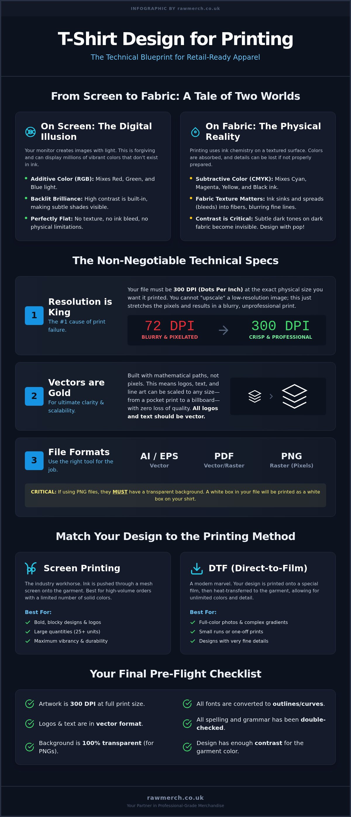
Art on a screen is light. Art on a shirt is chemistry. "Print-ready" isn't a suggestion; it's a technical standard that determines whether your merchandise looks professional or amateur. If your file isn't production-ready, your final product will suffer. High-quality t-shirt design for printing demands a shift in perspective. You aren't just making a picture. You are creating a technical blueprint for a physical object. Most digital files fail because they don't account for the physical constraints of ink, pressure, and heat.
Contrast and legibility are your primary tools for success. On a backlit monitor, subtle shades of charcoal might look distinct against a black background. On a cotton shirt, those colours will merge into a muddy, invisible mess. You must design with the final garment in mind. This means choosing colours that pop and lines that are thick enough to survive the printing process. We see many designs fail because they ignore the reality of how ink bonds with fabric fibres.
The Difference Between Digital Art and Physical Apparel
Your monitor uses RGB light to create millions of vibrant colours. Printing uses CMYK ink. This transition often leads to "dull" results if you don't account for the colour gamut shift. Fabric isn't a flat, white piece of paper. It has texture. It has a nap. Ink sinks into the fibres, which can blur ultra-fine details or thin lines. Choosing between various T-shirt printing methods requires an understanding of how ink interacts with these different surfaces. A design that looks sharp at 400% zoom on a Retina display might become a muddy smudge once the ink bleeds into a heavy cotton weave. Digital art is static; apparel is three-dimensional and flexible.
Choosing Your Canvas: Garment Styles and Printability
The substrate dictates the strategy. A heavy, 200gsm cotton shirt provides a sturdy base but has a coarser weave. This is perfect for bold, blocky streetwear designs. Conversely, a soft-style ringspun garment offers a much smoother surface. This allows for higher detail in t-shirt design for printing, especially when using DTF or high-mesh screen printing. The "hand-feel" of the print is also affected by the garment. Large blocks of solid ink on a heavy shirt create a "shield" effect that feels stiff. If you want a retail-soft finish, incorporate the shirt colour into the design using knock-outs. This reduces ink weight and increases comfort. Always match your design complexity to the surface of the t-shirt to ensure a high-quality finish.
Technical Specs: Mastering High-Resolution and Vector Files
Technical precision is the difference between a retail-ready garment and a bin-worthy disaster. When preparing a t-shirt design for printing, your file specifications are non-negotiable. We accept AI, EPS, PDF, and high-resolution PNG files, but each serves a specific purpose. One of the most common mistakes we see is submitting a design with a "white box" background. Always use transparent backgrounds for PNGs. This ensures the ink only lands where your art exists, rather than leaving a rigid, unprinted square of white ink on your coloured shirt.
Resolution is the number one cause of print failure in the UK apparel industry. The industry standard is 300 DPI (dots per inch) at the actual size you want the print to be. If you start with a low-resolution image, you cannot simply "save it larger" later. Photoshop and Canva can stretch those pixels, but they can't invent missing data. The result is a blurry, jagged print that looks cheap. Starting with the right specs saves you time and money. If you aren't sure if your file is ready, you can always contact our technical team for a quick review before placing a bulk order.
Why Vectors are the Gold Standard for Merch
Vectors are built on mathematical paths rather than pixels. This means you can scale a logo from a business card size to a billboard without losing a single ounce of clarity. If you are designing a logo or typography, it must be vector-based. Beyond clarity, vector files are essential for traditional screen printing because they allow us to separate colours with surgical precision. Understanding the difference between Vector vs Raster for T-Shirt Printing is the first step toward professional-grade results. For a deep dive into the technical steps of creating these files, check out our vector image guide.
Resolution and Sizing: Avoiding the Blurry Print
For a standard A3 chest print, your canvas needs to be roughly 3508 x 4961 pixels. This provides the density required for a crisp finish. Small images pulled from social media or websites are usually 72 DPI. These will always look pixelated when enlarged for a shirt. Your t-shirt design for printing must be built on a high-resolution canvas from the very first click.
To check your resolution effectively:
- In Photoshop: Go to Image > Image Size and ensure the resolution is set to 300 Pixels/Inch at the physical print dimensions.
- In Canva: Use a high-resolution custom canvas size (e.g., 30cm x 40cm) from the start and export as "PDF Print" to maintain quality.
Precision at this stage guarantees that the final product matches your digital vision perfectly. Don't settle for "good enough" resolution; aim for production-ready perfection.
Strategic Design: Placement, Sizing, and Colour Selection
Strategic design is the bridge between a great idea and a wearable product. You can't just slap a logo in the middle of a canvas and hope for the best. Professional t-shirt design for printing requires a calculated approach to sizing and placement that considers the human body. Standard print sizes vary significantly. For adult garments, a standard front print usually sits around 30cm to 35cm wide. If you're designing for youth sizes, you must scale down to roughly 20cm to 25cm to ensure the art doesn't wrap into the armpits. For oversized streetwear, you might push those boundaries to 40cm for a "boxier" look that dominates the fabric.
Always respect the "Safety Zone". Keep your critical text and fine details at least 2cm away from seams, collars, and hems. Printing over a seam causes ink buildup and distortion. It looks amateur and often leads to premature cracking in the print. We recommend mocking up your design on a template that reflects the actual garment size to avoid these technical pitfalls.
Print Placements That Make an Impact
Placement is psychology. A "Left Chest" logo is the industry standard for corporate workwear and uniforms. It’s subtle and professional. It keeps the brand visible without being overbearing. For band merchandise, the "Full Front" design is king. It maximises the real estate available. This allows for complex illustrations that catch the eye from across a room. Don't forget the back of the garment. A small nape print or a large, bold back design can complement the front art. This adds a premium feel to your merchandise. Using a T-shirt design placement guide helps you visualise how these choices impact the final silhouette and brand identity.
Colour Management: CMYK vs. Pantone
Colour behaves differently on fabric than it does on a backlit screen. If you’re using DTF (Direct to Film) printing, standard CMYK is your best friend. It handles intricate gradients and multi-colour art with ease. However, for large bulk orders of corporate or band merch using screen printing, Pantone (PMS) matching is essential. It ensures your brand’s specific "Electric Blue" looks identical on every single shirt in the run.
When creating a t-shirt design for printing on dark garments, choose ink colours with high contrast. Avoid "sinking" colours like deep purples or dark browns on black shirts. They will disappear into the fabric. Always use a bright underbase or select high-opacity inks to ensure your colours remain vibrant after the first wash. We focus on results, and getting the colour right at the design stage is the only way to guarantee a professional finish.
Matching Your Design to the Best Printing Method
Your artwork style dictates the machinery we use. Picking the wrong method is a fast track to disappointment and wasted budget. High-quality t-shirt design for printing isn't a one-size-fits-all process. You must decide whether your priority is razor-sharp detail, industrial-grade durability, or cost-efficiency for large volumes. We use our 25 years of industry experience to match your creative vision with the most effective production technology available in the UK today.
Simplifying your art is the easiest way to save money. If you're planning a bulk run, look for ways to reduce your colour count without losing the essence of your brand. A clever two-colour design often carries more impact than a cluttered, full-colour mess. Every decision you make at the design stage has a direct impact on the final unit cost and the longevity of the garment.
Designing for Screen Printing (Bulk & Durability)
Screen printing remains the gold standard for high-volume orders. It's the go-to choice for band merchandise and large-scale promotional events. This method uses physical stencils, meaning every colour in your design requires a separate screen. To keep your production costs low, limit your palette to one or two solid colours. Avoid gradients, glows, or drop shadows. These effects are difficult to replicate with traditional ink and often require expensive halftone setups. Focus on bold, high-contrast shapes that can withstand thousands of washes without fading.
Designing for DTF and Sublimation (Detail & Vibrancy)
Direct to Film (DTF) has revolutionised the industry. It's perfect for t-shirt design for printing that features photorealistic imagery or complex multi-colour gradients. Unlike screen printing, DTF doesn't care how many colours you use. It’s the ideal solution for small, intricate logos on various fabric types, including cotton and blends. The ink sits on top of the fabric, providing a vibrant finish that pops against dark backgrounds.
Sublimation is a different beast entirely. It's the only choice for all-over prints where the design needs to cover every inch of the garment. However, it comes with a strict design constraint: it only works on 100% white polyester. The ink turns into a gas and dyes the fibres directly. This means you can't feel the print at all, making it perfect for performance sportswear. If your design requires a cotton-soft feel with infinite colours, stick with DTF.
Ready to start your next project? Request a custom clothing printing quote today and let our specialists handle the technical logistics for you.
The Final Checklist: Preparing Your Files for RAW Merch
Your creative work is done. Now it's time for the technical hand-off. A single oversight at this stage can lead to hundreds of unusable garments. Printers don't proofread your work. We focus on the precision of the output, not the accuracy of your spelling or the logic of your dates. Professional t-shirt design for printing requires a disciplined final review before you hit the upload button. We've seen 25 years of avoidable mistakes; most are fixed with five minutes of focused checking.
Verify your print dimensions one last time. Your canvas size must match the physical dimensions you want on the shirt. If your mockup shows a 30cm wide print, your file must be exactly 30cm wide. Don't leave it to guesswork. Ensure your colours are locked in. If you are using screen printing, your Pantone codes must be clearly defined in your brief. For DTF, your CMYK values should be final. A mismatched colour mode can lead to unexpected shifts in the finished product that look nothing like your monitor.
The Ultimate Pre-Flight Checklist for Print
Converting your fonts to outlines is the most critical final step to ensure your text appears exactly as intended without requiring the printer to own your specific typeface. This process turns your text into uneditable vector shapes. It prevents "missing font" errors that can halt production. Next, scan your file for stray pixels. In DTF printing, even a single microscopic dot of colour will be picked up by the film, creating unwanted spots on your garment. Finally, confirm your background is 100% transparent for all non-rectangular designs. If you see a white box on your screen, you'll see a white box on your hoodie. Clean files lead to clean results.
Ready to Print? How to Submit Your Order
We've made the submission process as direct as possible. Our quote tool is designed for bulk business and band requirements. It gets straight to the point. When you're ready, provide a clear brief to ensure a smooth journey through our production schedule. You need to include your garment choice, the exact quantity you need, and your preferred printing method based on the art you've created. Being specific helps us hit your deadlines with pinpoint accuracy.
Don't leave your merchandise to chance. You've done the hard work of creating the art; let us handle the industrial execution. Get your custom t-shirt printing quote from the experts and turn your digital concepts into professional-grade apparel today. We are ready to bring your vision to life without the complication.
Ready to Turn Your Concepts into High-Quality Apparel?
You now have the technical blueprint to master t-shirt design for printing. By prioritizing vector files, 300 DPI resolution, and strategic placement, you've eliminated the risks of pixelated prints or muddy colours. Whether you're choosing screen printing for high-volume band merch or DTF for intricate, multi-colour logos, your preparation is the key to professional results. Don't let a small technical error ruin a bulk order. Follow the final checklist, outline your fonts, and verify your dimensions before you hit upload to ensure every garment looks exactly like your digital mockup.
RAW Merch is here to handle the industrial execution. With 25+ years of specialist printing expertise, we are the trusted partner for UK bands and businesses looking for reliability and quality. Our premium DTF, screen printing, and sublimation services ensure your creative vision translates perfectly to the final garment. We take your production-ready files and deliver a product your audience will love to wear. Stop guessing and start producing with a team that values your creative vision as much as you do. Get a Professional Quote for Your T-Shirt Design today and let's get your project on the press.
Frequently Asked Questions
What is the best file format for t-shirt design for printing?
The best file formats for t-shirt design for printing are vector-based files like AI, EPS, or high-resolution PDFs. These allow for infinite scaling without any loss of quality. If you are using raster images, a high-resolution PNG with a transparent background is acceptable. Always ensure your design is created at 300 DPI at the actual print size. This ensures your artwork remains sharp and professional throughout the production process.
Can I use a low-resolution photo for my t-shirt design?
Using a low-resolution photo is never recommended for professional apparel. Standard web images are usually 72 DPI, which will appear pixelated and blurry when enlarged for a t-shirt. For a crisp finish, your artwork must be 300 DPI at the final print dimensions. If you only have a low-res image, it often needs to be recreated as a vector to ensure it meets our quality standards for bulk orders.
Why do my t-shirt colours look different from my screen?
Screens use RGB light to display colours, while printing uses CMYK or Pantone inks. This physical difference means some vibrant digital shades cannot be perfectly replicated on fabric. Additionally, the garment's colour and material impact how the ink is absorbed. Using Pantone matching for screen printing is the best way to ensure consistent brand colours across your entire order, bridging the gap between your monitor and the physical shirt.
What is the difference between vector and raster art for t-shirts?
Vector art is based on mathematical paths, allowing it to be scaled to any size without losing clarity. This is the industry standard for logos and typography. Raster art is made of pixels; if you enlarge it beyond its original size, it becomes blurry. For high-quality t-shirt design for printing, vectors are preferred for screen printing, while high-res raster files are suitable for detailed DTF or sublimation work.
How big should my design be on a standard t-shirt?
A standard full-front print usually measures between 30cm and 35cm wide for adult garments. For a left-chest logo, the industry standard is typically 8cm to 10cm wide. It's important to consider the smallest garment size in your order to ensure the design doesn't wrap into the armpits. Always mockup your design on a template to visualize the scale relative to the collar and side seams before submitting.
Do I need to leave a bleed area for t-shirt printing?
Unlike paper printing, t-shirt printing does not require a traditional bleed area. Instead, you must respect a "safety zone". Keep all critical text and fine details at least 2cm away from collars, shoulder seams, and bottom hems. Printing over these areas causes ink distortion and can lead to the print cracking. Providing a clean file with a transparent background is more important than including bleed margins.
Can I print a design with a lot of small text?
You can print small text, but legibility is the primary concern. For screen printing, we recommend a minimum font size of 10pt to ensure the ink doesn't bleed and fill the gaps in letters. DTF can handle slightly finer details, but ultra-thin lines may struggle to bond with the fabric. Always convert your fonts to outlines to prevent typeface errors and ensure the text prints exactly as designed.
How many colours can I use in a screen-printed design?
For screen printing, you should ideally limit your design to 1-4 colours to keep production costs efficient. Each colour requires its own physical screen and setup. While we can print more, high-colour designs are often better suited for DTF (Direct to Film) printing. DTF allows for unlimited colours and gradients without the need for multiple screens, making it a cost-effective choice for intricate, multi-coloured artwork.