
A stunning design means nothing if it's trapped in a low-quality file. You want your merch to look as sharp on fabric as it does on your high-definition screen. We know the anxiety of sending off a bulk order and worrying about pixelation or muddy colors. It's a common hurdle for businesses and bands alike. Mastering the specific artwork guidelines for t-shirt printing is the only way to ensure your creative vision translates perfectly to the final product.
You don't have to deal with the stress of ruined orders or endless back-and-forth emails. We are here to provide the technical framework that makes your designs shine. This guide breaks down the essential requirements for vector files like AI and EPS, the rules for 300 DPI raster files, and how to handle color profiles. You will learn exactly how to save your work to avoid common mistakes and guarantee a high-quality result. Let's get your files ready for a flawless print run.
Key Takeaways
- Transform your creative concepts into production-ready files that require zero modification before hitting the press.
- Prevent dull or unexpected results by mastering the shift from RGB screen colors to CMYK and Pantone ink profiles.
- Follow specific artwork guidelines for t-shirt printing to ensure your design perfectly matches the technical requirements of screen printing or DTF.
- Use safe zones and proper placement strategies to keep your art clear of seams, necklines, and the natural curves of the body.
- Adopt a professional submission protocol and file-naming system to fast-track your order and eliminate unnecessary back-and-forth.
ESSENTIAL FOUNDATIONS: WHAT MAKES ARTWORK PRINT-READY?
"Print-ready" isn't just an industry buzzword. It's a standard of technical excellence. When we say artwork is print-ready, we mean it requires zero modification before hitting the production line. Many clients confuse a "concept" with a "production file." A concept is a visual idea, like a rough sketch or a low-resolution mock-up. A production file is the precise technical blueprint that tells our machines exactly where to lay ink. If we have to stop to fix your files, your production deadline slips. At RAW Merch, we've spent 25 years perfecting our workflow. We prioritize technical accuracy because we know that a high-quality bulk order starts with a flawless file. Following strict artwork guidelines for t-shirt printing ensures your project moves from the digital screen to the physical garment without a hitch.
VECTOR VS RASTER: THE GOLDEN RULE OF MERCH
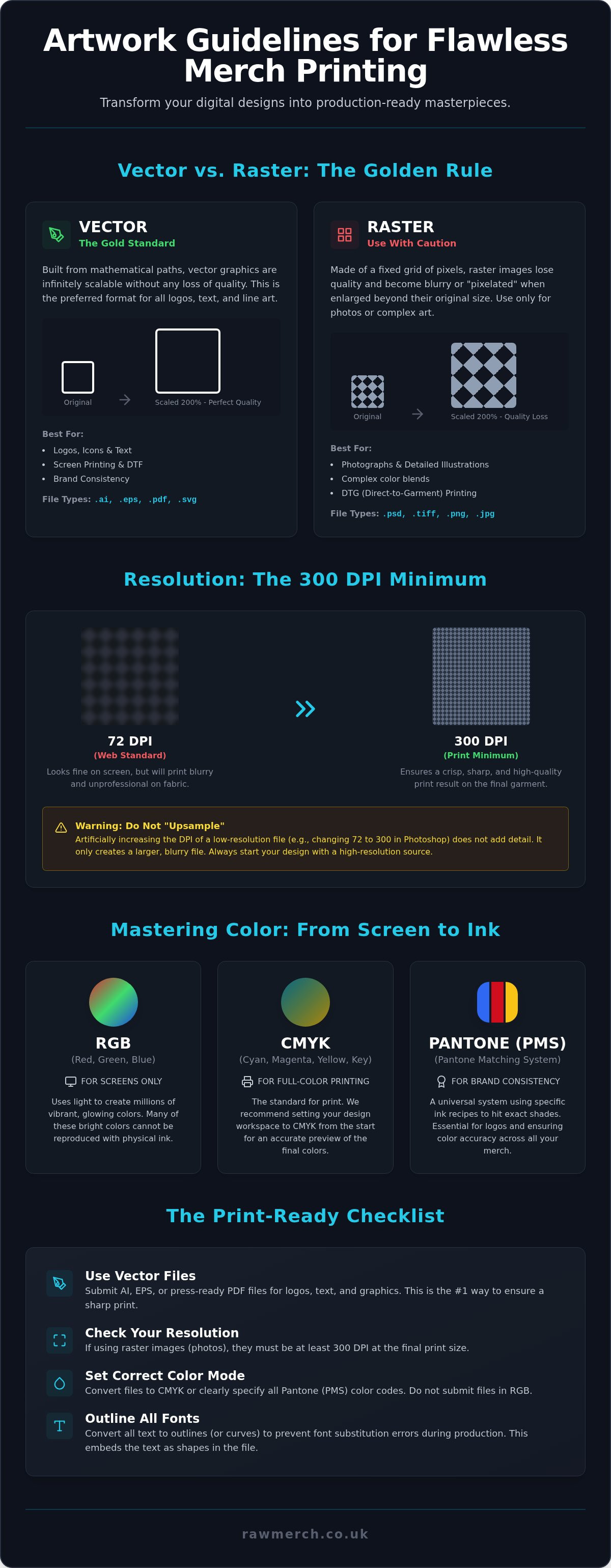
The most important distinction in digital art is the difference between vector and raster files. Vector graphics use mathematical paths to define shapes, which makes them infinitely scalable. You can blow a vector logo up to the size of a billboard without losing a single sharp edge. This is why vectorizing art is the gold standard for branding and professional merchandise. A vector image is a resolution-independent file created in software like Adobe Illustrator. Conversely, raster images are made of fixed pixels. If you stretch a small JPEG, it will look blocky and unprofessional. Don't fall for the common trap of simply saving a low-resolution JPEG as a PDF. It doesn't magically turn pixels into math; it just hides a bad file inside a different container.
RESOLUTION AND DPI: AVOIDING THE BLURRY TRAP
If you must use raster images for complex illustrations or photos, resolution is everything. We require a minimum of 300 DPI (Dots Per Inch) at the actual print size. This ensures that the physical ink droplets used in the Screen Printing Process create a crisp, solid image on the fabric. Internet images are usually 72 DPI. They might look fine on your smartphone, but they will look blurry and "stepped" on a hoodie. To check your resolution, open your file in Photoshop and look at the Image Size settings. If the resolution is low, don't just type in "300." This "upsampling" doesn't add detail; it just creates a muddy mess. You must start with high-resolution assets to get a high-resolution result. Adhering to these artwork guidelines for t-shirt printing is the only way to guarantee the professional finish your brand deserves.
MASTERING COLOUR: CMYK, PANTONE, AND RGB PITFALLS
Your computer screen is a liar. It uses Red, Green, and Blue (RGB) light to create millions of vibrant, glowing colours. Fabric, however, uses physical ink. This fundamental difference between light-based colour and ink-based colour is where most design heartbreaks happen. If you want a perfect result, you must understand how colour translates from a glowing pixel to a cotton thread. Following pro-grade artwork guidelines for t-shirt printing prevents that sinking feeling when your bulk order arrives looking duller than you expected. We take pride in our 25 years of industry experience, ensuring your creative vision doesn't get lost in translation.
THE CMYK SHIFT: WHY YOUR SCREEN LIES TO YOU
Designing in RGB is a common mistake for beginners. Most software defaults to RGB because it's meant for digital displays. When you convert that file to CMYK (Cyan, Magenta, Yellow, and Key/Black) for production, you'll often see an "out of gamut" warning. This means the printer cannot replicate those hyper-bright neon greens or electric blues using standard inks. We recommend setting your workspace to CMYK from the very first click. This gives you a realistic preview of the final product and saves you from last-minute disappointments. Don't forget about "Rich Black" either. Using 100% Black (K) often looks like a dark grey on white garments. For a deep, obsidian finish, we use a specific mix of all four process colours to give the ink more weight and depth.
USING PANTONE (PMS) FOR BRAND CONSISTENCY
For band merchandise or corporate uniforms, "close enough" isn't good enough. The Pantone Matching System (PMS) is a universal language for colour. It allows us to mix specific ink recipes to hit your brand's exact shade every single time, regardless of the garment. While standard CMYK is great for high-detail photos, specifying Pantone colours is essential for logos and text. You can see how these specific inks are prepared and applied in this step-by-step screen printing guide, which explains the traditional layering process. Keep in mind that Pantone matching can vary slightly depending on the base garment colour, especially when printing on dark fabrics that require a white underbase. We handle these complex colour profiles daily to ensure your brand stays consistent across every item in your order. If you're ready to start your next project, view our custom clothing range to see how we can bring your colours to life.
OPTIMISING ART FOR SPECIFIC PRINTING TECHNIQUES
Not all artwork is created equal. A sleek, two-colour corporate logo has different technical needs than a hyper-detailed band illustration with hundreds of shades. At RAW Merch, we don't force your art into a one-size-fits-all process. We analyze your file to determine if Direct-to-Film (DTF), screen printing, or sublimation will produce the sharpest result. Our goal is to ensure your vision translates perfectly to the garment while keeping your budget in mind. Understanding these specific artwork guidelines for t-shirt printing helps you choose the right design path from the start.
SCREEN PRINTING: SIMPLIFYING FOR SPOT COLOURS
Screen printing is the classic choice for bulk orders. It relies on "spot colours," where each individual ink colour requires its own physical screen. This is why simplifying your art can lead to significant cost savings. If you're designing band merch with high-contrast illustrations, consider reducing your palette to two or three colours. We use half-tones to create the illusion of gradients, but for the cleanest look, solid lines are best. Tiny, intricate details can sometimes "close up" when the ink hits the fabric, so keep your line weights bold. When printing on dark fabrics, we always apply a white under-base first. This acts as a primer, ensuring your top colours look vibrant rather than muddy. It's a critical step that separates professional gear from amateur prints.
DTF AND SUBLIMATION: HANDLING FULL-COLOUR DETAIL
For those who won't compromise on detail, DTF is a modern hero. It handles full-colour photographs and complex digital paintings with ease. Unlike screen printing, there are no colour counts to worry about. You can have a thousand colours for the same price as one. However, technical challenges remain. Soft, fading edges or "outer glows" can be tricky for the DTF adhesive to grab. We recommend using hard edges or "halftoned" glows to ensure the print remains durable after dozens of washes. If you're working with 100% polyester performance wear, sublimation is the only way to go. It dyes the fabric fibres directly. This means the print has zero "hand feel" and will never crack or peel. Following these artwork guidelines for t-shirt printing ensures we use the exact right tool for your specific creative vision. We bridge the gap between your digital file and a high-quality physical product that lasts.
SIZING, PLACEMENT, AND THE REAL-WORLD FIT
Your design doesn't live on a flat screen. It lives on a moving, breathing, three-dimensional body. This is where many designers fail. They create a beautiful graphic but forget that fabric folds, stretches, and moves. At RAW Merch, we've spent 25 years seeing how art translates to the real world. We know that a design placed two inches too low can ruin the entire aesthetic of a brand. Following professional artwork guidelines for t-shirt printing means respecting "safe zones." You must avoid printing over seams, necklines, or pockets unless you're specifically aiming for an all-over print effect. In 2026, we're seeing a massive trend toward oversized, "boxy" prints that push the limits of standard dimensions. These "heavyweight" styles require a different approach to weight and balance than a standard retail fit.
STANDARD PRINT PLACEMENTS FOR MAXIMUM IMPACT
Placement choice defines the garment's purpose. A "Left Chest" logo is the standard for corporate uniforms and workwear. We typically recommend a width of 80mm to 100mm for this. It's professional and subtle. For high-impact brand visibility, a "Full Front" or "Back Centre" print is the go-to. If you want to add premium value to your merchandise, don't overlook the nape of the neck or the sleeves. These small, thoughtful placements signal quality and attention to detail. We often see bands use nape prints for their tour dates or logo icons, which adds an extra layer of exclusivity to the piece.
SCALING ART ACROSS DIFFERENT GARMENT SIZES
The biggest mistake in bulk ordering is the "One Size Fits All" myth. If you use a single screen size for a run that includes both XS and 3XL shirts, the result will look awkward. A 300mm wide print will swallow a petite XS garment but look like a postage stamp on a 3XL. This is a gap many other printers ignore. They'll slap the same design on every shirt to save time. We don't do that. Standard adult print areas usually peak at 300mm x 400mm. However, you need a strategy to bridge the gap between sizes. We help you find the "sweet spot" dimension that looks balanced across the entire size run. For larger orders, we often suggest using two different screen sizes. This ensures the art looks intentional on every body type rather than accidental. If you're ready to see how your design fits, check out our professional clothing printing options today.
THE RAW MERCH SUBMISSION PROTOCOL: GET IT RIGHT
The final submission is the "last mile" of your creative journey. You've followed the artwork guidelines for t-shirt printing, selected your colours, and perfected your placement. Now, you need to hand over the baton to our production team. We don't just hit "print" and hope for the best. Every order at RAW Merch undergoes a rigorous technical review. We provide a digital artwork approval proof before a single drop of ink touches the fabric. This ensures that what you see on your screen is exactly what we intend to produce. It's our way of leveraging 25 years of experience to prevent costly mistakes and keep your project on schedule.
FILE FORMATS AND NAMING CONVENTIONS
FINAL CHECKLIST BEFORE YOU HIT SEND
Perform a final "sanity check" to ensure your files move straight to the production line. Missing a simple technical step can delay your order by days. Follow this checklist to guarantee a smooth process:
- Outline Your Fonts: This is the most common reason for file rejection. If you don't convert text to outlines, our system might replace your unique font with a generic one.
- Check for Transparency: If you are submitting a PNG for DTF printing, make sure you've completely removed the background colour. We don't want to print a white box around your logo.
- Line Weights: Ensure your thinnest lines are at least 1pt thick. Anything thinner might disappear during the screen printing process or fail to bond correctly in DTF.
- Check Your DPI: Re-verify that any raster elements are at 300 DPI at the final print size.
By adhering to these artwork guidelines for t-shirt printing, you're not just a client; you're a professional partner in the production process. We're ready to bring your vision to life with the precision it deserves. If your files are prepped and your checklist is complete, it's time to get started. Upload your artwork and get a bulk quote now and let's get your merch into production.
BRING YOUR CREATIVE VISION TO LIFE
High-quality merchandise is never an accident. It's the direct result of technical precision and a deep understanding of artwork guidelines for t-shirt printing. You now have the tools to navigate the CMYK shift, the importance of vector scalability, and why placement matters for a real-world fit. These foundations ensure your bulk order arrives exactly as you imagined it. We handle the technical heavy lifting so you can focus on the creative vision for your brand or band.
RAW Merch provides the expert framework to make your designs shine. With over 25 years of UK printing expertise, we are the trusted partner for touring bands and national businesses across the country. Our production facility utilizes precision DTF and screen printing technology to deliver durable results. We pride ourselves on being a seasoned, no-nonsense specialist that prioritizes your deadlines and your satisfaction. We bridge the gap between your digital files and a physical product you'll be proud to distribute.
Stop worrying about pixelation and start focusing on your growth. GET YOUR BULK MERCH QUOTE FROM RAW MERCH TODAY. We are ready to help you get your next project on the press and into the hands of your fans.
Frequently Asked Questions
What is the best file format for t-shirt printing?
Vector files like .AI, .EPS, and high-resolution .PDF are the gold standard for professional results. These formats use mathematical paths rather than pixels, allowing us to scale your design infinitely without any loss in quality. While we can accept high-resolution .PNG files for Direct-to-Film (DTF) projects, vector files provide the sharpest possible lines for screen printing.
Can I use an image I found on Google for my t-shirt design?
You cannot use images found on Google without explicit permission from the original creator. Beyond the legal risks of copyright infringement, most web images are only 72 DPI, which is far too low for physical production. We require high-resolution, original assets to ensure your merchandise looks professional and avoids a blurry, pixelated finish.
Do I need to outline fonts in my artwork files?
You must outline all fonts in your artwork files before you hit the upload button. If you don't convert your text to paths, our systems might not recognize the specific typeface and will substitute it with a generic font. Outlining your text is the only way to guarantee your typography remains exactly as you intended across our entire production line.
What happens if my artwork isn't high enough resolution?
Low-resolution artwork results in blurry, "stepped," or pixelated prints that look unprofessional on a finished garment. If your file is below the 300 DPI minimum, the physical ink droplets cannot form a sharp, clean edge on the fabric. Adhering to our artwork guidelines for t-shirt printing prevents these technical failures and ensures your brand looks its absolute best.
Is there a difference between the art for screen printing and DTF?
Screen printing requires designs with a limited number of solid "spot" colours, whereas DTF can handle complex, multi-colour illustrations with ease. Every extra colour in a screen print requires a physical screen setup, which increases the total cost of your order. DTF is the superior choice for photographs or designs with intricate gradients that traditional screens cannot replicate.
How do I ensure the colours on my t-shirt match my brand's logo?
Specify Pantone (PMS) codes in your design files to ensure perfect colour consistency across your entire bulk order. While CMYK is used for process printing, the Pantone Matching System allows our team to mix a precise ink recipe for your specific brand shade. This is the industry standard for maintaining a professional image across different garment colours and fabrics.
Can you print over seams, zippers, or pockets?
We strongly advise against printing over seams, zippers, or pockets because the uneven surface causes ink to pool or gap. These areas are outside the "safe zone" for high-quality production and often lead to a messy, unreliable finish. To achieve a professional result, always keep your primary design elements within the flat, unobstructed panels of the garment.
Should I include crop marks or bleed in my t-shirt art?
You do not need to include crop marks or bleed in your files because we print directly onto pre-constructed garments. Simply provide your art at the exact dimensions you want it to appear on the shirt. Following these artwork guidelines for t-shirt printing helps our team position your design accurately and moves your order straight to the production phase.