
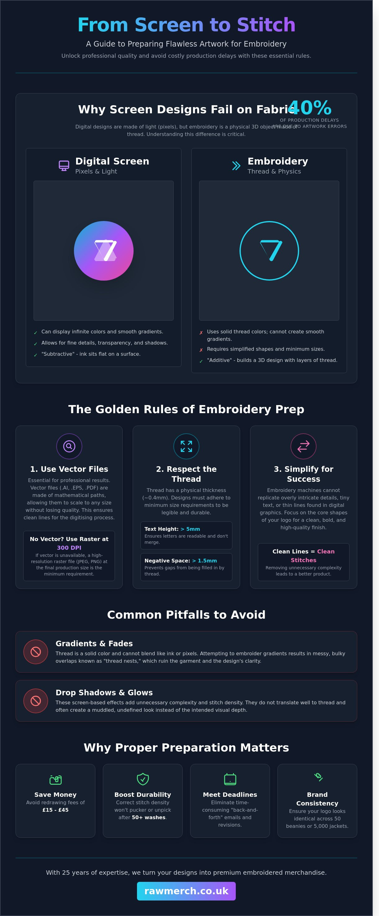
A digital design that looks crisp on your screen can easily become a bunched, unreadable mess once the embroidery machine starts running at 1,000 stitches per minute. You want your brand merchandise to scream quality, not amateur hour. It's a common frustration. Recent industry data shows that 40% of production delays in the UK garment sector are caused by mistakes when preparing artwork for embroidery. We know you want results without the fuss.
When you move from screen to stitch, the rules change. We aren't using ink; we're using physical thread. You might feel confused by digitising or worried that your intricate logo will lose its detail. We've spent 25 years perfecting this process. You're going to learn how to transform your digital designs into flawless embroidered merchandise by mastering the technical requirements of the needle and thread. We'll give you a clear checklist to ensure your uniforms look professional while helping you avoid those annoying setup fees.
Key Takeaways
- Understand the vital difference between flat printing and "additive" embroidery to ensure your design translates perfectly to thread.
- Master the industry standards for preparing artwork for embroidery and learn why vector files are essential for professional results.
- Navigate technical limitations by applying the 5mm rule for text and simplifying complex logos for a cleaner finish on fabric.
- Audit your digital files for gradients and transparency to create a production-ready design that the machines can handle with ease.
- See how our 25 years of expertise and rigorous proofing process ensures we deliver your custom merchandise on time, every time.
What Does Preparing Artwork for Embroidery Actually Mean?
Preparing artwork for embroidery isn't just about saving a file as a PDF or a JPEG. It is the vital bridge between a static digital graphic and a dynamic stitch file that a Tajima or Barudan machine can actually read. Think of it this way: screen printing is "flat" or "subtractive," where ink sits on top of a surface. Embroidery is "additive." You are building a physical 3D object using layers of thread. When you are preparing artwork for embroidery, you are planning for texture, height, and tension.
You need a specialist digitiser to translate your art into needle movements. They map the path the needle takes, the density of the stitches, and where the machine starts and stops. A logo that looks sharp on a 2560px Retina display often fails on a hoodie if it hasn't been handled correctly. Web graphics are built for light. Embroidery is built for physics. If the art isn't prepped, the machine won't know how to handle the "pathing," leading to gaps or thread breaks.
The Fundamental Difference: Pixels vs. Stitches
Thread has physical weight and thickness. Most standard UK embroidery uses 40-weight viscose or polyester thread, which has a fixed width of approximately 0.4mm. You cannot shrink a complex 10-colour gradient into a 5mm space because thread doesn't blend like ink pixels. Gradients and drop shadows are the biggest enemies of clean embroidery. They usually result in "thread nests" or messy, bulky overlaps that ruin the garment's drape.
We also have to account for "push and pull." Fabric is flexible and moves during production. As the needle strikes the material at 800 stitches per minute, the fabric naturally pulls inward. Proper art prep compensates for this movement by slightly overlapping certain elements in the digital file. This ensures that when the garment comes off the frame, the design is perfectly aligned and hasn't distorted the fabric.
Why Proper Preparation Saves You Money
Getting your files right from the start protects your bottom line. When you provide clean, high-resolution vector files, you reduce the manual labour required by the digitiser. This helps you avoid "redrawing fees" which can often cost between £15 and £45 for complex designs. We've spent 25 years in this industry, and we know that clean art leads to a better finished product every single time.
- Durability: Well-prepped art ensures the stitch density is perfect. This means the design won't unpick or pucker after 50 washes.
- Deadlines: We know what you want. You need tour merch or event kit delivered on time, everytime. Correct preparing artwork for embroidery means no "back and forth" emails that eat into your production window.
- Brand Consistency: Professional prep ensures your logo looks identical across 50 beanies or 5,000 softshell jackets.
Don't settle for "good enough" web files. High-quality preparation is the difference between a premium garment and a wasted investment. YOU WANT IT, WE CREATE IT!
Essential File Formats and Technical Specifications
The golden rule of professional embroidery is simple: use vector files. When you are preparing artwork for embroidery, your file choice determines the final stitch quality. Vector files are built from mathematical paths rather than pixels. This means they scale to any size without losing clarity. If you are unsure about the technical differences, read our guide on what is a vector based image to understand why these files are the industry standard for high-end merch.
YOU WANT IT, WE CREATE IT! Our team relies on AI, EPS, and high-resolution PDF formats. These files provide the cleanest lines for our digitising software. Low-resolution JPEGs are a nightmare for embroidery. They create jagged, pixelated edges that lead to messy stitch paths and poor definition. If a vector isn't available, your raster file must be at least 300 DPI at the final production size to avoid a sub-par finish.
Vector vs. Raster: Why Your Choice Matters
Raster images are made of tiny squares called pixels. When you enlarge a JPEG or PNG, these pixels stretch and blur. This makes it impossible for a digitiser to plot exact needle points. Vector files avoid this entirely. They allow our team to see every curve and corner with 100% precision. This precision is what separates a professional corporate logo from a cheap, DIY-looking badge. We've spent over 25 years perfecting this process, so we know exactly how to handle your files for the best result.
Managing negative space is another critical technical factor. If your design has tiny gaps between shapes, the thread will likely bridge those gaps during production. This causes bunching and ruins the detail. We recommend maintaining at least 1.5mm of clearance between distinct elements. This ensures the fabric stays flat and your design remains sharp. If you need a second pair of eyes on your design, contact our team for a quick file check.
Setting Up Your Canvas and Colours
Efficiency is key to keeping your project on schedule. Organise your layers logically in your design software. This helps the digitiser understand the "stacking" order of the threads. We know what you want; we deliver on time everytime by following these specific technical standards:
- Limit your palette: We restrict designs to a maximum of 12 to 15 thread colours. This ensures production efficiency and keeps your costs manageable.
- Use Pantone references: Standardise your colours using Pantone Matching System (PMS) codes. This ensures the physical thread matches your brand identity exactly.
- Outline your fonts: Always convert text to "outlines" or "curves". If you don't, our system might substitute your custom font with a generic one.
When you are preparing artwork for embroidery, remember that the machine doesn't see images the way a printer does. It sees paths, density, and direction. By providing clean, organised files, you empower us to create the best possible version of your vision.
Navigating Embroidery Limitations: Detail, Text, and Fabric
Embroidery isn't printing. You're dealing with physical thread and needles, not ink. This means your digital design must follow physical rules. When preparing artwork for embroidery, you must respect the 5mm rule. Any text smaller than 5mm in height will likely close up and become an unreadable blob. We've seen it happen too often; don't let your brand look amateur by cramming too much into a small space.
Simplifying complex logos is a necessary step for a professional finish. If your logo has tiny gradients or hair-thin lines, they won't translate to thread. We often remove these fine details to ensure the final product looks sharp. If a line is thinner than a needle's width, it won't show up. It's better to have a bold, clean design than a cluttered mess that looks like a mistake.
Borders and outlines are another area where "thin" is a dangerous word. A border needs substance to stay straight and visible. If a border is too thin, the fabric tension pulls it out of alignment, resulting in a jagged or "shifty" appearance. We recommend a minimum width of 1.5mm for any border that needs to look consistent across a production run of 50 or more garments.
Text and Line Weight Guidelines
Satin stitches need a minimum thickness of 1mm to look solid. Run stitches, which are single lines of thread, work for tiny details but lack the impact of a satin stitch. Clean sans-serif fonts like Helvetica or Arial are your best friends here. Serif fonts have tiny "feet" that often vanish or look like loose threads when shrunk down. For a standard polo shirt logo, maintain a minimum line weight of 1mm to prevent the stitch from sinking into the fabric.
Garment-Specific Art Adjustments
Fabric type changes everything. Pique fabrics, commonly used for polo shirts, have a bumpy, cellular texture. Your art needs to be robust to sit on top of that weave without getting lost. Smooth hoodies are more forgiving, but they still have "push and pull" factors that can distort thin lines. If you're designing for heavy winter gear, check out our custom bobble hats guide to understand how thick knit textures impact your design clarity.
The garment itself is the foundation of the final product, and different professions have unique requirements. For those sourcing professional attire for sectors such as corporate, beauty, or spa services, a specialist supplier like The Staff Uniform Company can provide a wide range of suitable options.
Cap designs require a specific approach when preparing artwork for embroidery. We digitise cap designs to stitch from the "bottom-up" and "centre-out." This sequence prevents the fabric from bunching or flagging as the needle moves across the curved surface. Keep your most complex elements in the centre of the cap frame for the best results. Large, flat blocks of stitching near the seams of a 6-panel cap will almost always cause registration issues.
Step-by-Step Guide to Cleaning Up Your Design
Clean files lead to sharp results. You want a professional finish, so stop treating your embroidery file like a digital web graphic. When preparing artwork for embroidery, your first task is a full audit of the design. Start by flattening every layer. Hidden objects or stray anchor points might stay invisible on your screen, but an embroidery machine reads every single path. These "ghost" objects create unnecessary stitch clusters that can break needles or ruin the fabric tension.
Next, simplify your palette. Most industrial embroidery machines operate with 12 to 15 needles. If your design uses 30 different shades of blue, you're overcomplicating the process. Limit your colour count to match standard thread ranges like Madeira or Isacord. This ensures the final product looks exactly like your digital proof. We've spent over 25 years perfecting this process, and we know that a streamlined colour set always produces a punchier, more durable result.
Removing Complex Elements
Thread is a physical medium. It doesn't do "see-through." If your design includes transparency or opacities, you must convert these to solid colours. Gradients are another common pitfall. A smooth digital fade doesn't translate to a needle and thread. Replace gradients with solid blocks of colour or use "halftone" patterns where dots of different sizes simulate a transition. This creates a textured, high-end look without the mess of messy stitch overlaps. Always remove overlapping paths; stacked stitches create "bullets" of thread that feel uncomfortable against the skin and look bulky.
Scaling and Proportions
Precision is everything in the merchandise game. Set your artboard to the exact physical dimensions of the finished product. For a standard left-chest logo, work on a 90mm canvas. If you're designing for a cap, stay within a 55mm height limit. Remember that embroidery hoops have fixed sizes. A 12cm hoop only provides about 10cm of actual embroidery space because the machine needs "bounce" room. Keep your design centred and balanced. A logo that looks great on a flat screen might look lopsided once it's stretched over the natural curves of the human body.
Perform the "Squint Test" before you finish. Stand back from your monitor and squint at the design. If the details blur into a mess, they're too small for a needle to replicate. Text must be at least 5mm tall to remain legible. If your letters are smaller than that, the "holes" in letters like 'a' or 'e' will close up with thread. Preparing artwork for embroidery requires a balance between your creative vision and the physical limits of the machine. Get these basics right, and your merch will look top-tier every time.
Ready to see your design on high-quality garments? Contact RAW Merch for a no obligation quote and let's get your project started.
From Digital File to Finished Stitch: The RAW Merch Process
We've spent 25 years turning creative visions into high-quality physical products. At RAW Merch, we understand that the transition from a digital file to a finished garment requires more than just a machine. It takes a seasoned eye. Our process starts with a rigorous review of your files. We catch technical issues like overlapping paths or tiny text early in the cycle. This attention to detail is why we're known for reliability. We deliver on time everytime because we don't let small errors turn into big delays.
Before we hit the start button on our industrial machines, we provide a digital mock-up. This proofing stage allows you to see exactly how your design sits on the garment. It's the final check to ensure the scale and placement are perfect. For those planning a larger rollout, our band merchandise guide offers deep insights into bulk order strategies and retail readiness. We take the guesswork out of production so you can focus on your brand.
Expert Digitising Services
Auto-digitising software is a shortcut we refuse to take. These automated tools often create designs with excessive stitch counts or poor pathing, which results in stiff embroidery that ruins the drape of a shirt. Our expert team digitises every design by hand. We adjust the thread density specifically for the fabric you've chosen. A heavy fleece needs a different approach than a 100% organic cotton tee. This manual precision ensures your artwork remains flexible and durable. We've processed thousands of designs since 1999, and our commitment to quality control remains our top priority.
Ready to Start Your Project?
Submitting your project for a no-obligation quote is straightforward. We recommend sending vector files or high-resolution 300dpi images to ensure the best results when preparing artwork for embroidery. Tell us the quantity you need and your preferred garment styles. Providing these details upfront allows our team to give you an accurate price and a fast turnaround. We're ready to help you create something exceptional. YOU WANT IT, WE CREATE IT! Contact us now to get your project moving. We know what you want; we deliver on time everytime!
GET YOUR DESIGNS STITCH-READY TODAY
Mastering the technical side of preparing artwork for embroidery ensures your brand looks sharp on every garment. High-quality results depend on clean vector files and an understanding of how thread interacts with different fabrics. You've seen how detail limits and text height impact the final finish. Now it's time to let the professionals handle the heavy lifting. We've spent 25 years perfecting our craft. We know exactly how to translate your digital vision into high-quality physical merchandise that stands out from the crowd.
Our expert UK-based digitising team takes the guesswork out of the process. We use our 25+ years of industry experience to guarantee your design translates perfectly to fabric. We know what you want and we deliver on time, every time. Whether you're ordering 50 premium hoodies or 500 custom polo shirts, our quality standards never slip. Stop worrying about stitch counts and let our seasoned experts take control of your next project.
Contact RAW Merch for a no-obligation embroidery quote today!
We're ready to turn your ideas into a reality that your customers will love to wear.
Frequently Asked Questions
Can I use a photo for embroidery?
You can use a photo for embroidery, but it requires a specific digitisation process to convert pixels into physical stitches. Our team translates your JPEG or PNG into a specialist stitch file that captures the essential details of the image. Keep in mind that thread has physical limits, so we simplify complex gradients to ensure a clean finish. We've handled over 500 photo-to-stitch projects this year to guarantee your design looks sharp on any garment.
What is the best file format for embroidery artwork?
High-quality vector files like .AI, .EPS, or high-resolution PDFs are the best formats for preparing artwork for embroidery. These files allow us to scale your logo without losing any clarity or detail during the conversion process. If you only have a low-resolution .JPG, don't worry. We can usually redraw it for you. Providing clean vector lines ensures our software produces the most accurate stitch path for our industrial machines.
Why is there a setup fee for embroidery but not always for print?
Embroidery requires a one-off setup fee because a technician must manually create a digital stitch map of your design. This process dictates exactly where every one of the 5,000 to 15,000 stitches will land. Unlike digital printing which uses standard ink outputs, embroidery setup involves selecting specific paths, angles, and densities. Once we've created this file, we keep it on record for all your future orders to save you time.
How small can text be in an embroidered logo?
Text in an embroidered logo should be at least 5mm in height to remain legible and professional. Anything smaller than 5mm often results in the "holes" in letters like 'a' or 'e' closing up due to the thickness of the thread and the needle. We recommend using sans-serif fonts for small lettering. This ensures every character stays distinct and your brand remains clear even on textured fabrics like 220gsm pique polos.
Do I need to provide Pantone colours for my thread?
You should provide Pantone (PMS) references if you have them so we can match your brand colours as closely as possible. While thread is a physical medium and won't always be a 100% identical match to a backlit computer screen, we stock over 400 different thread shades to hit your target. If you don't have a specific code, our experts will pick the closest match from our standard Madeira or Isacord ranges.
Can you embroider over a seam or a zip?
We cannot embroider directly over a seam or a zip because the uneven surface causes needle breakages and distorted stitching. Our machines require a flat, stable area to maintain consistent tension throughout the job. For the best results, we recommend placing your logo at least 10mm away from any seams or zips. If you need branding near a fastening, we'll look at alternative positions that still provide high visibility.
What happens if my artwork is too complex for embroidery?
If your artwork is too complex, we'll work with you to simplify the elements for a better result. Fine gradients or tiny details often don't translate well into physical thread. In these cases, we might suggest removing small outlines or increasing the size of certain features. When preparing artwork for embroidery, our goal is durability and impact. If embroidery isn't the right fit, we'll recommend high-definition DTF transfers instead.