

A colour-perfect screen can still produce a different-looking print. To understand how to ensure colour accuracy in printing, manage colour consistently from the original image or artwork through to the finished item, using calibrated devices, suitable ICC profiles and a proof before production.
It’s frustrating when a design looks right on screen but prints with unexpected colour. Cameras, monitors and printers interpret colour differently: screens use RGB, while print processes use CMYK, and some screen colours are outside the range print can reproduce.
This guide explains how colour management connects each stage, why the material and colour gamut matter, and how calibration and proofing can reveal differences before a full run. You’ll also learn when to prepare files with an appropriate ICC profile and why a proof should reflect the final print conditions as closely as possible. These steps help you set realistic expectations and make informed decisions about colour.
Key Takeaways
- Match the ICC profile to the printer and material so colours are interpreted appropriately for the final output.
- Calibrate your monitor regularly and use consistent colour settings to reduce drift between design and print.
- Use soft proofs and test prints to catch colour or contrast issues before a larger production run.
- Review printed colours under lighting similar to the setting where the finished item will be seen.
ICC colour profiles and gamut limitations
Choose a profile that matches the output device and material, then check how its gamut limits colour reproduction.
-
Choose ICC Profiles for Devices and Substrates
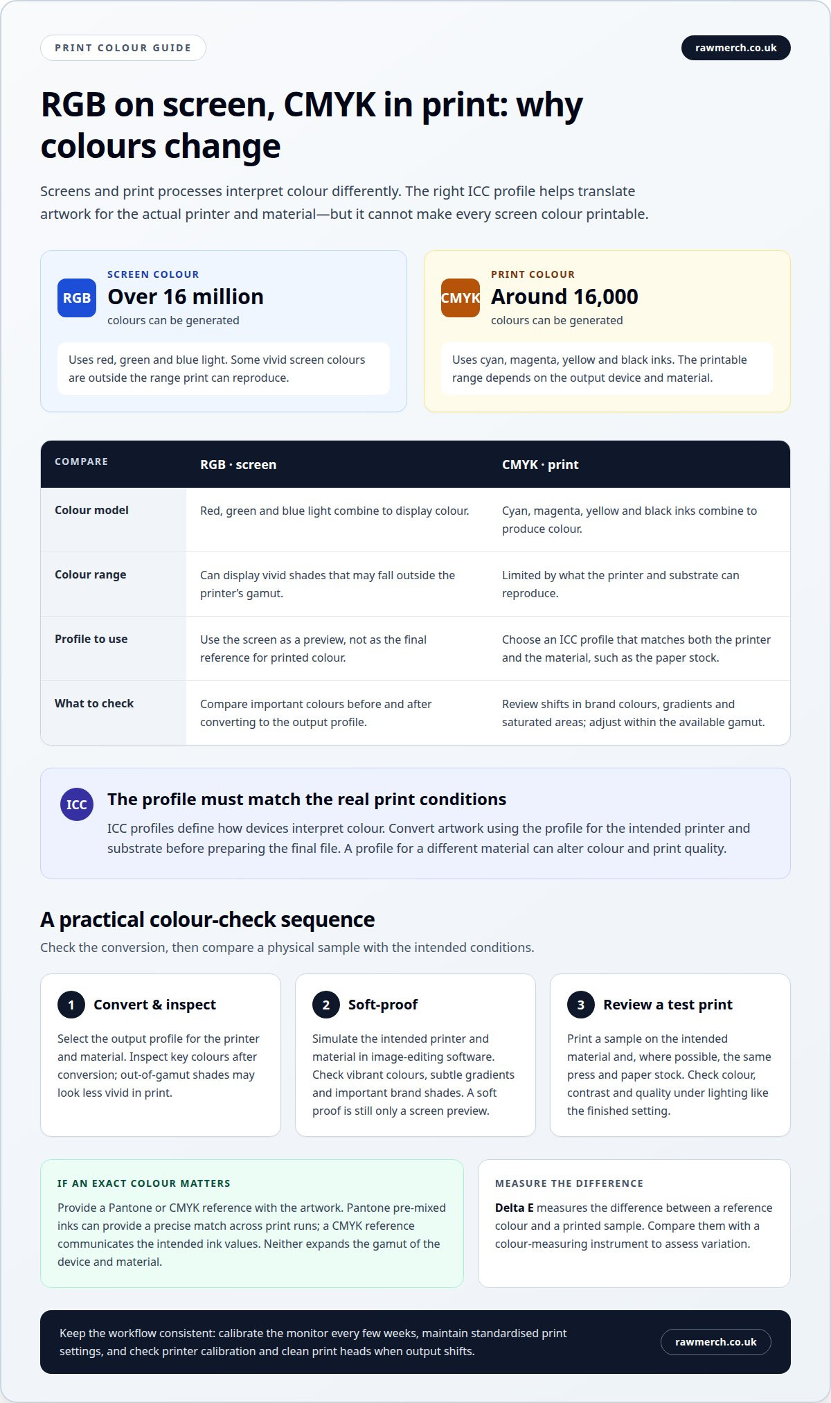
Choose an ICC profile that matches the printer and substrate, such as the paper used for a photographic print. ICC profiles define how devices interpret colours, helping translate image values into printer output. In your image-editing software, convert the artwork to the appropriate printer and substrate profile before preparing the final file.
Don’t choose a profile simply because it is available. A mismatch between the selected profile and the actual material can alter colour and print quality. For example, a profile intended for one paper type may not represent how another reproduces the same image.
-
Set RGB or CMYK Artwork Settings
Set the artwork colour mode for the intended print process. Screens display colour using RGB, which can generate over 16 million colours; CMYK printing can generate around 16,000. This difference means some bright screen colours cannot be reproduced within the print gamut.
RGB describes red, green and blue light, while CMYK uses cyan, magenta, yellow and black inks. To prepare artwork for print, choose the appropriate ICC profile and convert the image to it. Review colours after conversion, especially vivid shades that may fall outside the printer’s gamut. A screen preview cannot show every print limitation.
- Check the gamut before finalising colours. A colour outside the reproducible range of the printer and substrate must be adjusted during conversion, so it may look less vivid in print than on screen. If an exact colour matters, provide a Pantone or CMYK reference with the artwork. Pantone pre-mixed inks can provide a precise match across print runs, while a CMYK reference communicates the intended ink values. These references clarify the target, but they don’t expand what a device and material can reproduce.
For a practical check, compare important colours on screen before and after converting to the output profile. Look closely at brand colours, gradients and saturated areas. If the converted version shifts noticeably, adjust the artwork within the available gamut before approving it for print.
What is Colour Management?
Colour management helps keep colour consistent through image capture, screen viewing and print production. Common causes of colour shifts include uncalibrated devices, changing settings and dirty print heads. Trace the difference to its source before adjusting the artwork.
-
Calibrate the Monitor
Recalibrate your monitor every few weeks to keep its display aligned with industry standards. Use a hardware calibration tool, such as a colorimeter, to measure and adjust the screen rather than relying on visual judgement alone. A calibrated display helps colours appear closer to the final print. Avoid editing artwork on a screen with unstandardised settings, as its preview can mislead your colour decisions. To understand how to ensure colour accuracy in printing, treat the monitor as one stage in a larger chain, not the final reference.
-
Calibrate the Press
Set and maintain standardised colour settings on the press before production. Consistent settings help keep output stable across a print run, and press calibration gives operators a controlled starting point for colour reproduction. Compare a production sample with the intended colour reference, then correct the settings if the result shifts. Record the working settings so later runs use the same baseline. A repeat job, for example, should start from the recorded setup rather than newly chosen settings.
-
Calibrate and Maintain the Printer
Calibrate the printer regularly and keep its print heads clean. These routine checks help maintain consistent output and reduce colour drift between jobs. Use the same standardised colour settings for repeat work, then inspect a sample for uneven or unexpected colour. If print quality changes, check the printer calibration and head cleanliness before adjusting the artwork. This helps distinguish an equipment issue from a file or colour-setting issue.
-
Identify and Fix Colour Shifts
Trace a colour shift through the workflow: compare the screen preview, printer output and press settings. Cameras, monitors and printers can interpret colour differently, while calibration drift, inconsistent settings or dirty print heads can change the result. Correct the stage causing the difference, then produce another sample to assess the adjustment. These checks show how to ensure colour accuracy in printing without making unnecessary changes to the design. For clothing printing, review the print project with the artwork and colour references ready.
Test prints and proofing
Use soft proofs and printed samples to assess colour, contrast and overall quality before approving a larger run. Delta E measures the difference between a reference colour and a printed sample. Compare both with a colour-measuring instrument to assess the variation.
-
Create Soft Proofs
Enable soft proofing in your image-editing software to simulate how the image may appear in print. Select output conditions that match the intended printer and material, then inspect vibrant colours, subtle gradients and important brand shades. Adjust the artwork if the simulated result shows a visible shift. A soft proof helps identify likely differences, but it remains a screen preview, not a physical sample.
-
Print and Review Test Prints
Print a test sample before approving full-scale production. Use the intended material and, where possible, the same press and paper stock planned for the finished job. Review colour accuracy, contrast and overall print quality, paying close attention to vivid areas and fine tonal changes. Assess the sample under controlled lighting that reflects where the finished print will be displayed. If you spot a colour or contrast issue, adjust the artwork or production settings and review another sample before approval.
-
Measure Print Accuracy with Delta E
Measure the printed colour and its reference with a colour-measuring instrument, then compare their readings as Delta E. A smaller difference indicates a closer match. The measurement helps assess variation, but doesn’t explain its cause by itself. Record which sample and reference you compared, and measure the same colour areas consistently. Use the results alongside a visual review under controlled lighting, as a numerical comparison and the viewing environment provide different information about the print.
Colour management across cameras, monitors and printers
Keep the workflow consistent from camera capture to printed output. Each device can interpret colour differently, so a clear hand-off between stages is crucial.
- Start with a consistent camera capture. Photograph a colour reference alongside the subject when accurate colours matter, such as for a product image or brand graphic. Use the reference when reviewing the image rather than relying only on memory or an uncalibrated screen. This gives you a practical point of comparison before editing.
- Prepare the image for editing on a calibrated monitor. Compare key colours in the captured file with the intended reference, then make adjustments while viewing the image under consistent conditions. A red garment, for example, may look different on a camera display and a computer screen. Calibration makes the monitor a more dependable stage in the workflow.
- Prepare the artwork for the print process. Convert the image using the output profile for the relevant printer and substrate, then review the result. Screens display RGB colour, while print uses CMYK, so a vivid screen colour may not translate directly. Check important brand shades after conversion and keep the intended colour reference with the file.
- Compare the first printed sample with the approved reference under controlled lighting. If the printed red differs from the camera image, identify where the change appears: capture, monitor display, conversion or printer output. Correct that stage before producing the full run. For repeat work, retain the approved reference and compare new prints against earlier versions. This colour audit helps reveal drift across batches, locations and time. If you’re planning printed clothing, plan your print project with these colour references ready.
RAW Merch: clothing printing
RAW Merch prints colour-managed artwork on clothing, including Custom T-Shirts & Hoodies, Promotional Items and Headwear. For a garment run, share the final artwork and any Pantone or CMYK colour references so the intended colours are clear.
Colour can vary between a screen and a printed garment, so use an approved proof to review how the design appears on the chosen material before production. Clear references and feedback on the proof help focus decisions on the colours that matter most, such as a recognisable brand shade or strong contrast in the design.
For clothing printing, contact RAW Merch to discuss your project and artwork.
Put Your Next Print Project into Motion
If you’re deciding how to ensure colour accuracy in printing for an upcoming garment project, include colour requirements in the brief from the start. Identify the shades that matter most, share the relevant artwork and references, and consider how the design should look on the finished item. This gives the production conversation a clear focus, especially when a specific brand colour needs close attention.
RAW Merch prints Custom T-Shirts & Hoodies, Promotional Items and Headwear. Bring your project details and colour references together before production, so the intended result is clear and practical decisions can be discussed.
Contact RAW Merch about print colour and start planning your next print project with confidence.
Frequently Asked Questions
How does colour management ensure accurate printing?
Colour management coordinates how colour is captured, displayed and reproduced, reducing differences between devices. A photograph, for example, may look different on a camera screen and computer monitor before it reaches print. A consistent workflow helps identify where the change occurs, so adjustments can target the camera image, display or print setup rather than changing the artwork blindly.
How should a monitor be calibrated for colour-accurate printing?
Use a hardware calibration tool, such as a colorimeter, and set the monitor to an industry-standard colour display. Recalibrate every few weeks, particularly if you regularly prepare print files. Keep the screen in consistent viewing conditions while editing, and avoid judging a colour-critical design on a second, uncalibrated display. This makes the monitor a more dependable reference for your artwork.
Which colour profiles and ICC settings should I use for UK printing?
Choose the ICC profile that matches the printer and material. There isn’t one universal ICC setting for every UK print job: the correct choice depends on the output device and substrate. For example, artwork destined for one paper type may need a different profile from dimensional branding and signage produced by First Stop Signs Print. If a specific brand shade matters, include its Pantone or CMYK reference with the artwork.
What is a printer colour proof, and when should I request one?
A printer colour proof is a sample or digital preview used to review artwork before a full production run. Use a physical proof when you need to assess the actual material, colour, contrast or finish. A soft proof helps preview the image on screen. RAW Merch emails a digital proof for approval, and production starts after proof approval and receipt of payment.
How do paper type, finish and lighting affect printed colours?
Paper type can affect colour and photographic print quality, while viewing light can change how a printed shade appears. A sample viewed under one light may look different under the lighting where it will be displayed. Review the proof on the intended material and under controlled lighting that resembles its final viewing environment before approving the result.
What should I check before approving a print run?
Review the proof against your approved artwork and colour references before authorising production. Check that key brand shades, image contrast, placement and details look right, then consider whether the material and viewing conditions reflect the finished item. Raise any visible mismatch at this stage. For a RAW Merch order, approval matters because production begins after the digital proof is approved and payment is received.