

Most modern merch looks like it was printed in a lab, not a rock club. It's too clean, too plastic, and lacks the soul of a classic 70s tour tee. You know the frustration of designing something legendary only to have it arrive looking like a stiff, rubbery shield. Learning how to create a distressed look print is about more than just a quick Photoshop filter. It's a technical synergy between your digital artwork, the ink chemistry, and the garment itself.
You want a professional grade vintage aesthetic that feels as good as it looks. We'll show you how to master this art by combining precise digital textures with professional printing techniques. You will learn which textures work best for screen printing and how to avoid the unintentional cracking that ruins a brand's reputation. We are diving into the specific workflows that turn a standard bulk order into a piece of wearable history.
This guide covers everything from high contrast bitmap masks to choosing the right inks for a soft hand-feel. We will break down the exact methods used by seasoned experts to ensure your next UK merch run hits that perfect, aged vibe without any of the usual guesswork.
Key Takeaways
- Master how to create a distressed look print by choosing between high-mesh screen printing for authentic cracking or DTF for intricate, multi-colour weathering.
- Learn how to use non-destructive layer masks and high-contrast grunge textures in Photoshop to achieve a professional-grade vintage aesthetic without damaging your original artwork.
- Select the right canvas by understanding how tri-blend fabrics and heavyweight blanks enhance the natural fading and "hand-feel" of a distressed design.
- Understand critical technical thresholds, such as the 2mm detail limit for DTF, to ensure your micro-cracks and fine textures remain durable after commercial washing.
- Leverage 25 years of UK-based industry expertise to scale your creative vision from a digital concept to a retail-ready bulk merchandise order.
What is a Distressed Look Print and Why Does it Work?
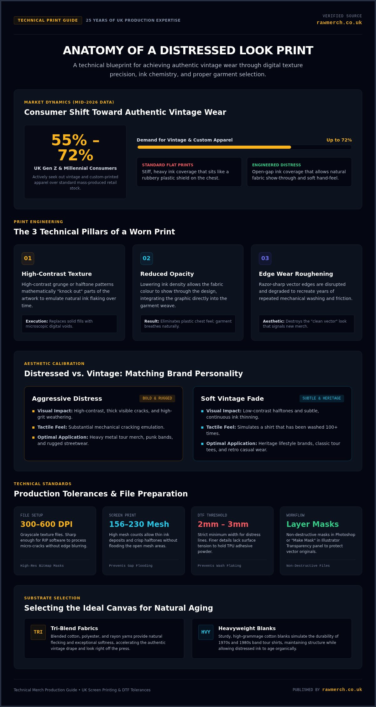
Distressed printing is the art of making something brand new look like it has survived three decades of world tours. It is an intentional aesthetic choice that uses weathering, cracking, and fading to tell a story. If you want to know how to create a distressed look print that actually looks authentic, you have to move beyond simple filters. While a standard print aims for total ink coverage and sharp lines, a distressed design embraces the gaps. This style is currently dominating the UK market. Data from mid-2026 shows that between 55% and 72% of Gen Z and Millennial consumers actively seek out vintage and custom-printed apparel over mass-produced retail stock.
The resurgence of the "Vintage Band Tee" in 2026 isn't just about nostalgia. It is about authenticity. In a world of digital perfection, a "perfect" plastic-feeling print can look cheap or corporate. Authentic brand storytelling requires character. Mastering how to create a distressed look print allows you to bypass the "new shirt" feel and deliver a product that looks like a prized heirloom from day one. Physical wear takes years of washing and friction, but stylistic digital distress lets us simulate that history instantly for your bulk orders.
The Anatomy of a Worn Print
A convincing distressed print relies on three technical pillars. First is texture. We use high-contrast grunge or halftone patterns to "knock out" parts of the design. This creates the illusion of ink that has flaked away over time. Second is opacity. By reducing ink density, we allow the garment's natural fabric to show through. This "show-through" effect makes the print feel like part of the shirt rather than a sticker sitting on top of it. Finally, we address edge wear. Clean vector lines are the enemy of vintage. We roughen the boundaries of the artwork to simulate years of friction and washing.
Distressed vs. Vintage: Knowing the Difference
People often use these terms interchangeably, but they serve different brand personalities. Distressed is usually aggressive and high-contrast. Think of heavy metal merch with thick, visible cracks and high-grit textures. It is a bold statement for brands that want an edgy, rugged feel. Vintage is about the soft fade. It uses low-contrast halftones and subtle ink thinning to mimic a shirt that has been washed a hundred times. Matching the style to your brand is vital. A heritage lifestyle brand might prefer a soft vintage wash, while a touring punk band needs the high-impact energy of a heavily distressed screen print. We help you navigate these choices based on 25 years of production experience.
Digital Design: How to Create a Distressed Texture
Creating the perfect production file is where the vintage magic happens. You cannot simply slap a low-resolution jpeg over your logo and expect a retail-quality result. To master how to create a distressed look print, you must start with high-contrast grayscale textures. We recommend using files at 300 to 600 DPI. These high-resolution textures ensure that every micro-crack and grit particle is sharp enough for the RIP software to process without blurring the edges of your design.
The most professional method involves using non-destructive layer masks. In Adobe Photoshop, you apply your texture as a Layer Mask rather than erasing the artwork directly. In Adobe Illustrator, you use the Transparency panel via the "Make Mask" function. This technique keeps your original artwork intact while creating transparent "knock-outs." When we print these files, the ink only hits the solid areas, letting the fabric colour breathe through the gaps. This is the secret to avoiding that heavy, plastic feel on the chest.
For screen printing, these textures must be compatible with specific mesh counts. We typically use 156 to 230 mesh for distressed looks. High mesh counts allow for thin ink passes and sharp reproduction of fine halftones without flooding the openings. If you are opting for DTF, your digital distress lines must maintain a minimum width of 2mm to 3mm. Anything finer lacks the surface tension to anchor the TPU adhesive powder, which leads to premature flaking after a few washes. If you need help refining your files for bulk production, our team is ready to assist with your clothing printing requirements.
Vector vs. Raster Distress
While raster textures offer unparalleled grit and detail, vector images are essential for large-scale logos that need to remain sharp at any size. You can apply vector textures using the Pathfinder tool, but be careful. A design with ten thousand tiny vector anchor points can crash your software and slow down the printing press. For complex band merch designs, a high-resolution raster mask applied to a vector logo often provides the best balance of detail and performance.
Common Design Mistakes to Avoid
Avoid the trap of over-distressing. If your brand name becomes unreadable, the design has failed its primary purpose. Watch out for "tiled" textures where a small grunge pattern repeats visibly across the chest; it looks amateur and breaks the vintage illusion. Always remember that the shirt colour is your secondary palette. A black tee showing through a white distressed print creates a natural depth that makes the graphic look like it has been worn for decades.
Screen Printing vs. DTF: Choosing the Right Technique
Choosing the right production method is the difference between a retail-ready shirt and a cheap promotional giveaway. While your digital file sets the stage, the ink and machinery execute the performance. If you want to master how to create a distressed look print, you must understand how different techniques interact with the fabric. The "hand feel" of a shirt is often more important than the design itself for long-term wearability.
Screen printing remains the gold standard for authentic vintage cracking. It allows for specific ink deposits that we can engineer to feel rugged or soft. Direct to Film (DTF) is the modern alternative for high-detail distress without high setup costs. Intentionally distressing your DTF artwork isn't just for looks; it reduces ink and TPU powder coverage by 15% to 35%. This eliminates the rigid "sweat patch" effect and restores fabric breathability and drape. Sublimation is a niche choice that only works for "faded" looks on light polyester garments, as the dye becomes part of the fibre without any tactile crackle.
Ink Secrets for the Distressed Look
Plastisol inks are the industry workhorse. They sit on top of the fabric, making them perfect for heavy, "aggressive" cracked textures that need high durability. For those seeking maximum comfort, water-based inks are the key. They sink into the fibres, providing a "no-feel" vintage softness that collectors love. Discharge inks take this further by stripping the garment's existing dye and re-dyeing the raw cotton. This creates a truly integrated look that ages uniformly with the shirt. Keep in mind that discharge only works on 100% natural cotton; it won't react with synthetic polyester fibres.
Technical Considerations for Bulk Orders
Consistency is everything when you are producing 500+ units for a band merchandise tour. We utilize medium-to-high mesh counts, typically between 156 and 230 mesh, to ensure fine distress halftones don't flood during long runs. Higher mesh counts allow for sharp reproduction while maintaining a soft hand-feel. This level of precision prevents your detailed "grunge" from turning into a solid blob of ink after the first fifty shirts.
At RAW Merch, we bring 25 years of experience to every bulk order. We help you choose between plastisol for durability or discharge for that authentic retro vibe. Our UK-based production facility ensures your vision is executed with technical precision, ensuring every shirt in the box matches your approved sample.
Selecting the Perfect Canvas: Garments that Age Well
Your choice of fabric is just as critical as the artwork itself. If you put a weathered design on a stiff, basic promotional tee, it will look like a production error. To truly master how to create a distressed look print, you must select a canvas that supports the vintage illusion. The interaction between the ink and the garment texture is what creates a retail-ready product. Don't let a poor garment choice undermine your creative vision.
Fabric weight, measured in grams per square metre (GSM), dictates how the ink is absorbed. Heavyweight blanks, typically around 200 GSM or higher, provide the structural integrity needed for thick plastisol textures. For the ultimate vintage pairing, we recommend garment-dyed shirts. These are dyed after the garment is sewn, creating natural fading along the seam lines. The industry benchmark features a heavyweight rating of 207 g/m² and is soft-washed through a 50-wash cycle. When printing on these, we maintain dryer temperatures below 160°C to prevent dye migration and scorching. This technical precision ensures your how to create a distressed look print project looks professional and stays durable.
Top Fabric Choices for Distressed Prints
100% ring-spun cotton is the standard for a reason. It offers a soft surface that accepts ink consistently while providing that classic band merch feel. If you want a 1970s aesthetic, polyester and cotton blends are the way to go. These fabrics often have a natural heathering that adds a secondary layer of texture to your design. For those who want maximum impact, acid-wash or stone-wash bases provide a pre-distressed background that makes your print look like a genuine relic. If you are ready to start your next project, you can order your custom clothing printing here.
Colour Theory for Vintage Merch
Bright, neon colours rarely work for a vintage aesthetic. Stick to a muted palette. Charcoal, burgundy, and mustard yellow provide a sophisticated, weathered foundation. When choosing your print colours, remember that "off-white" or cream will always look more authentic than a stark, bright white. A professional trick is to use the garment colour as the "shadow" in your distressed texture. By letting the fabric show through the cracks in the ink, you create a design that feels integrated rather than applied. We ensure your colour choices translate perfectly across your entire bulk order.
Executing Your Vision with RAW Merch
Bringing a vintage vision to life requires more than just a good eye for design. It demands a production partner who understands the nuances of ink chemistry and fabric interaction. We have spent over 25 years perfecting the art of bulk apparel production. When you are learning how to create a distressed look print, you need the assurance that your digital textures will translate accurately to the final garment. We bridge that gap between your creative file and a retail-ready bulk order.
Scaling your brand shouldn't mean compromising on quality. Whether you need 25 units for a boutique launch or 5,000 for a nationwide tour, our UK-based facility is equipped to handle the load. We treat every order with the same technical rigour. We ensure that the intentional weathering in your artwork remains consistent from the first shirt to the last. Our team understands that for bands and fashion labels, the "vibe" of the print is just as important as the logo itself.
Our Expertise in Distressed Printing
Our professional screen printing setups are designed for high-detail textures. We don't just hit print; we calibrate our equipment to handle the specific mesh counts required for fine halftones. Quality control is our priority. Our experienced team monitors every run to ensure the wear in your design is intentional and consistent, never a production defect. For touring bands, we provide integrated UK warehousing and fulfillment. We get your merch where it needs to be, exactly when you need it, without unnecessary complications.
Ready to Create Your Vintage Collection?
Preparation is the key to a smooth production run. Ensure your files are high-resolution with clear transparency masks as outlined in our digital design section. We work with your provided art to ensure the technical tolerances for screen printing or DTF are met before we strike the first screen. Our no-nonsense approach means we give you direct feedback on what will work best for your specific garment and ink choice. We are here to enable your creative vision with professional execution.
Don't leave your brand's aesthetic to chance. Partner with a specialist who understands the history and the technical future of vintage apparel. GET A QUOTE FOR YOUR DISTRESSED PRINTS TODAY and let's build something legendary together.
DOMINATE THE VINTAGE MARKET WITH AUTHENTIC PRINTS
Achieving a retail-ready vintage aesthetic requires a technical balance between digital art and physical production. You now understand that how to create a distressed look print involves more than just a simple Photoshop filter. It's about choosing high-mesh screens for fine detail and pairing them with garment-dyed blanks that age naturally. Whether you opt for the soft hand-feel of water-based inks or the durable crackle of plastisol, your production choices define your brand's soul.
With over 25 years of industry experience, we specialize in bringing these complex band and brand visions to life. We are UK-based and operated, ensuring your bulk orders are handled with logistical precision and seasoned expertise. Stop settling for plastic-looking prints that lack character. Take control of your merchandise strategy today and deliver the authentic quality your audience demands.
START YOUR VINTAGE MERCH ORDER NOW
Your next legendary merch run starts with the right partner. Let's get to work and make your creative vision a reality.
Frequently Asked Questions
Can I create a distressed look with DTF printing?
Yes, you can achieve a professional vintage effect using Direct to Film (DTF) technology. By incorporating digital distress masks into your artwork, we can "knock out" parts of the design. This process reduces ink coverage by 15% to 35%, which eliminates the stiff feel of standard transfers. It restores fabric breathability and creates a soft, flexible drape that mimics high-end screen printing while maintaining intricate, multi-colour details.
Do I need a special file format for a distressed print?
Professional results require high-resolution files in PSD, AI, or PDF formats. To master how to create a distressed look print, you should use non-destructive layer masks or transparency knockouts at 300 to 600 DPI. This allows our production software to identify exactly where the ink should be omitted. Avoid low-resolution JPEGs; they lack the sharp edge detail needed for the RIP software to process authentic-looking cracks and grit.
Will a distressed print peel or crack more easily than a solid one?
Stylistic distress actually improves the longevity of the print's feel. Because there is less solid ink surface, the design is more flexible and less prone to the heavy, brittle cracking seen in thick plastisol layers. In DTF applications, distressed patterns increase the surface area for the garment to flex. We use industrial curing processes to ensure your intentional weathering remains permanent through repeated commercial wash cycles without peeling.
Is the distressed look more expensive for bulk orders?
The cost for a distressed print is typically the same as a standard print. Pricing is based on the number of colours and the total quantity of garments rather than the complexity of the texture. For DTF orders, a distressed design actually uses less ink and adhesive powder. We specialize in bulk production for UK bands and brands, keeping your unit costs competitive while delivering a premium, retail-ready vintage aesthetic.
How do I make my logo look "cracked" in Illustrator?
You can create this effect using the Transparency panel. Place a high-contrast grayscale grunge texture over your vector logo. Select both the logo and the texture, then click "Make Mask" in the Transparency window. Uncheck "Clip" and check "Invert Mask" if necessary. This creates a non-destructive knockout that keeps your vector edges sharp while simulating a weathered effect. This method is perfect for maintaining scalability for large-scale branding.
What is the best t-shirt for a vintage-style print?
Garment-dyed or heavyweight ring-spun cotton tees are the superior choice. Blanks with a weight around 207 g/m² provide the structure needed for authentic vintage-style prints. These shirts often feature a soft-wash finish that complements a weathered design. Tri-blend fabrics are also excellent for a 1970s aesthetic. The natural heathering of the polyester, cotton, and rayon blend adds a secondary layer of visual texture that enhances the distressed look.
Can RAW Merch help me design the distress texture?
RAW Merch focuses exclusively on the technical execution of your project. We do not provide graphic design services; you must provide the final distressed artwork for production. However, our team offers expert technical advice on whether your files meet the necessary tolerances for screen printing or DTF. We use our 25 years of industry experience to ensure your provided art translates perfectly to the physical garment during the bulk printing process.
How many colours can I use in a distressed screen print?
You can use multiple colours, though each requires a separate screen and setup. For high-volume band merch, we often use two or three colours to maintain a classic retro vibe. If your distressed design features complex gradients or a high colour count, DTF might be the more cost-effective route. Regardless of the method, we ensure each layer is applied with the correct mesh count to preserve the fine detail of your texture.