

The colour that looks perfect on screen may not be the right choice for a printed T-shirt. With custom apparel color theory, the real test is how the garment, artwork and ink work together when the design is printed on fabric.
Pairing colours can feel uncertain, especially when a strong digital design may look different in print. You don’t need specialist design knowledge to make confident choices. A few practical principles can help you create a palette that suits your brand or creative idea and feels easy to wear.
This guide explains contrast and colour harmonies, then shows how garment shades and print methods affect the finished look. You’ll also find practical checks for preparing artwork before production. RAW Merch prints custom clothing using methods including screen printing, DTF and sublimation, with projects ranging from band merchandise to workwear and branded T-shirts.
Key Takeaways
- Use custom apparel color theory to build a palette around the purpose of the garment, then choose supporting shades that feel balanced and wearable.
- Compare monochromatic, analogous and complementary colour schemes to find a practical direction for your artwork.
- Consider how the garment colour and print method can affect the appearance and contrast of the finished design.
- Review artwork colours against the garment before production. A screen preview can’t guarantee the printed result.
- Connect your palette, garment, print method and artwork choices to make the design more production-ready.
What Does Colour Theory Mean for Custom Apparel?
For custom apparel, colour theory is the practical use of colour relationships to choose garment, artwork and ink shades that work together and remain clear on fabric. It helps you turn a visual idea into a palette suited to a T-shirt, hoodie or uniform, rather than relying on a screen preview alone.
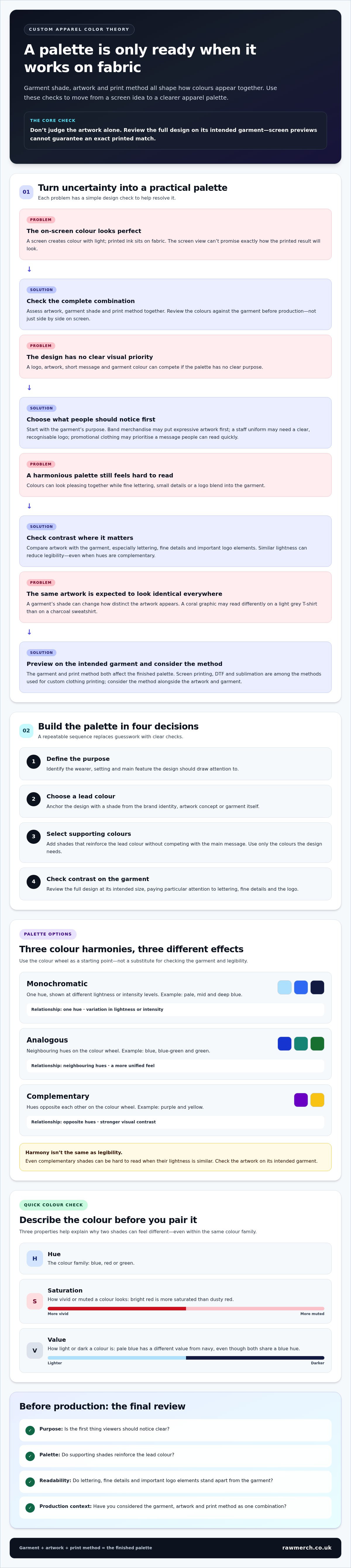
Three properties make colour easier to describe. Hue is the colour family, such as blue, red or green. Saturation describes how vivid or muted a colour looks: a bright red has stronger saturation than a dusty red. Value is how light or dark a colour is. A pale blue graphic, for example, has a different value from a navy garment, even though both share a blue hue.
A screen creates colour with light, while printed ink sits on fabric. The garment shade, artwork and print method all affect how colours appear together, so a screen preview can’t promise an exact printed match. Foundational color theory explains how hues relate. Apparel decisions add the practical question of how those colours will read on a garment.
How the colour wheel helps build an apparel palette
The colour wheel maps relationships between hues. Red, yellow and blue are commonly shown as primary colours; combining them creates secondary colours such as orange, green and violet. Tertiary colours sit between a primary and a neighbouring secondary, such as blue-green. Use the wheel as a starting point for finding shades that feel related or deliberately distinct.
Warm hues, such as red and orange, sit broadly opposite cool hues, such as blue and green. These labels describe their position and visual character, not a guaranteed emotional response. Context matters: the same green logo can feel fresh on a white T-shirt but subdued on a dark green hoodie, where the artwork blends more closely with the garment.
Why colour choices affect more than appearance
A consistent palette can support brand recognition across staff clothing, event merchandise and branded T-shirts. Colour also affects readability. Fine lettering in a shade similar to the garment may be hard to see, even if the combination looks attractive on screen.
Separate personal preference from practical contrast. You may like two similar shades together, but artwork needs enough difference from the garment to stay legible at its intended size. Consider whether the finished item feels wearable as well as recognisable. Colour associations vary between cultures and contexts, so treat symbolism as a design consideration, not a fixed meaning.
How to Choose a Custom Apparel Colour Palette That Works
A balanced apparel palette starts with a clear purpose. Choose a lead colour, add supporting shades and leave enough contrast for the design to read on the garment. Custom apparel color theory gives you a repeatable way to make those choices without relying on guesswork.
Match colour choices to the apparel’s purpose
Decide what the garment needs to do. Band merchandise might put expressive artwork first. A staff uniform may need a clear, recognisable logo, while promotional clothing could prioritise a short message people can read quickly. Ask what someone should notice first: the logo, artwork, message or garment colour.
Keep existing brand colours in view, but don’t assume every item needs the same balance. A lead colour can stay consistent while supporting shades or garment choices change to suit different uses.
- Define the purpose. Identify the wearer, setting and main feature the design should draw attention to.
- Choose a lead colour. Pick the shade that anchors the design. It might come from a brand identity, an artwork concept or the garment itself.
- Select supporting colours. Add shades that reinforce the lead colour without competing with the main message.
- Check contrast. Compare the artwork with the garment, especially lettering, fine details and important parts of a logo.
Use colour harmony without sacrificing legibility
Colour schemes are useful starting points, not rules. A monochromatic palette uses one hue at different lightness or intensity levels, such as pale, mid and deep blue. An analogous palette uses neighbouring hues on the colour wheel, such as blue, blue-green and green, for a more unified feel. A complementary palette pairs hues opposite each other, such as purple and yellow, to create stronger visual contrast.
Even a harmonious palette needs a practical legibility check. Complementary colours may stand out from each other, but small lettering or detailed artwork can be hard to read if the shades have similar lightness. Preview the whole design on its intended garment, not just the colours side by side.
There’s no universal ideal number of colours. A focused palette can make the message easier to follow and simplify production choices, while a detailed illustration may need more shades. Use only the colours the design needs. For custom clothing printing, consider the palette alongside the garment and artwork before settling on a combination.
How Garment Colour and Print Method Change the Finished Palette
A palette isn’t finished when the colours look right in the artwork. The garment underneath and the printing method both affect how those colours appear. Custom apparel color theory works best when you consider the artwork, fabric and production method as one combination.
Choose colours with the garment base in mind
The same artwork can look different on a light and a dark garment. Fabric can show through or sit behind the printed design, influencing how distinct its colours seem. A coral graphic on a light grey T-shirt may read differently from the same graphic on a charcoal sweatshirt. Neither result is automatically better. Choose based on the intended look and whether the artwork remains clear.
Check how key elements, especially text and fine details, stand apart from both the garment and neighbouring artwork colours. Contrast that works on a white digital canvas may not carry across to coloured fabric. Include the actual garment shade in palette planning instead of treating it as a neutral background.
Understand screen printing, DTF and sublimation colour considerations
Each method handles colour differently. Screen printing pushes ink through a mesh screen onto the garment. Designs may use separate ink colours, and an underbase, often a layer of white ink, can be used beneath other colours on darker garments to help them show. Suitability depends on the garment, inks and artwork.
DTF prints a design onto transfer film, which is then applied to the garment. The transfer can carry detailed, multicolour artwork; a white ink layer is commonly used to support colour on darker fabrics. Sublimation uses heat to transfer dye into suitable synthetic fibres, commonly polyester. Because the dye doesn’t form an opaque layer over the fabric, the garment base remains important. Light-coloured fabric is generally used so the design shows clearly.
No method guarantees a perfect match to a screen. The right option depends on the artwork, garment and desired finish, so don’t choose a process based on colour alone.
File colour settings matter, too. RGB describes colours made with light on screens. CMYK describes a combination of printing inks. Pantone is a colour-matching system used to specify colours, including spot-colour references. These systems aren’t direct equivalents: a shade displayed in RGB may not be reproducible exactly in CMYK or as a garment print. Treat colour values as useful production references, not a promise that every process will create an identical result.
How to Check Apparel Colours Before Production
A short pre-production review can catch colour and readability issues before artwork moves into printing. Screens display colour using light, while printed designs are viewed on fabric under real-world lighting. Display settings, garment shade and print method can all affect the result. Treat a digital preview as a useful guide, not a guarantee of an exact match.
Review artwork, contrast and colour references
Work through this sequence before approving the design:
- Check the artwork file. Make sure colours, text and fine details are clear, and that the file is prepared at the intended print size. Vector artwork can keep graphic edges clean when resized, which is useful for logos and designs that may appear at different sizes.
- Review the design at its actual size. Small text and narrow lines can look clear when enlarged on screen but become hard to distinguish on a garment. Check them at the scale they’ll be printed.
- Preview it on the chosen garment colour. Check each design element against the fabric, not only against a white artboard. Make sure key text, logos and artwork remain distinct.
- Share clear colour references. Supply consistent artwork files and, where relevant, colour values or a named reference system. These details help communicate your intentions, but can’t guarantee identical results across screens, inks, fabrics and print methods.
If you’re preparing a logo or other scalable artwork, the guide to vector images for merch printing explains how vector files can support clean edges at different sizes.
Consider a physical sample or production proof
A physical review can reveal details a screen preview misses, such as how the garment’s actual shade changes the perceived contrast or how the design sits on the fabric. If a sample or production proof is part of the project, review the garment shade, print placement and overall legibility together. Don’t assess the ink in isolation.
Use the clearest available reference and keep the final artwork and colour instructions aligned. That’s custom apparel color theory in practice: connect your chosen palette to the garment and the way it will be produced.
For an overview of RAW Merch’s custom clothing printing, see the service information.
Turn Your Colour Theory into Custom Apparel with RAW Merch
A print-ready palette comes from a connected set of decisions: define the apparel’s purpose, choose colours that support it, select a garment, match the print method to the project, then review the artwork against the garment before production. This is custom apparel color theory put into practice. Each choice can affect how the finished design looks and reads.
RAW Merch prints custom clothing and merchandise using screen printing, DTF and sublimation. This production experience helps connect the creative brief to practical choices about artwork, garment and print method.
Bring a clear colour brief to your apparel project
Start with the information that will guide the decisions. Share what the apparel is for, your preferred garment colours and any brand colour references. Identify the most important part of the artwork, such as a band logo, illustration or event message, and note where strong contrast is essential for legibility.
For band merchandise, the goal might be to carry distinctive artwork across T-shirts and hoodies while keeping key lettering readable on each garment colour. A clear brief helps keep those priorities in view as the palette and production choices take shape. For more planning ideas, explore the band merchandise planning guide.
Choose production support that fits the project
Screen printing, DTF and sublimation each have different production processes, so the most suitable approach depends on the artwork, garment and project requirements. A detailed multicolour design, a simpler graphic and a garment intended for sublimation each bring different considerations. The aim isn’t to force every idea into the same method, but to make sure the palette and artwork suit the way the garment will be produced.
Keep your final artwork, garment choice and colour instructions aligned. Clear references help communicate the intended result, while the production method remains part of the decision. RAW Merch prints custom T-shirts, hoodies, workwear and merchandise, bringing production experience to each project.
Have a colour palette or artwork in mind? Discuss your custom apparel project with RAW Merch and take the next step towards turning your idea into printed clothing.
Make Your Apparel Palette Production-Ready
Strong custom apparel color theory connects your creative idea to the finished garment. Start with the purpose, build a considered palette and check that the artwork stands out against the garment colour. Then account for the print method and review the artwork using clear colour references. Screen previews are useful, but they can’t guarantee an exact match on fabric.
These choices work best as a joined-up plan. RAW Merch prints custom clothing using screen printing, DTF and sublimation to suit different apparel projects. For merchandise projects, fulfilment and distribution support can also help carry the work beyond production.
Ready to turn your palette into custom clothing? Discuss your custom apparel project with RAW Merch. Bring your idea, preferred garment colours and artwork priorities to start planning your printed clothing.
Frequently Asked Questions
What is colour theory in custom apparel?
Colour theory explains how hues relate and how combinations affect contrast, harmony and visual emphasis. In custom apparel color theory, apply those principles to the artwork and garment together, then consider the print method. A bright logo may stand out on one garment shade but lose definition on another. Use colour theory to plan and review a design, not as a promise that printed colours will exactly match a screen.
How do I choose colours for custom T-shirts?
Start with the T-shirt’s purpose and decide what people should notice first, such as a logo, illustration or message. Choose a lead colour, add supporting shades, then check how the artwork contrasts with the garment. A monochromatic scheme uses one hue in different variations; analogous colours sit next to each other on the colour wheel; complementary colours create contrast. Review the full palette with the intended print method in mind.
Which colour combinations work best for custom apparel?
No single colour combination works best for every garment or design. Complementary colours, such as blue and orange, can create strong contrast. Analogous shades, such as blue and green, tend to feel more unified, while a monochromatic palette uses variations of one hue. Choose based on the garment shade, artwork and intended impression. Then check that text and key graphic details remain easy to distinguish on the garment.
Why can printed colours look different from colours on a screen?
Printed colours can look different because screens create colour with light, while apparel printing uses inks, materials and a production process. The garment shade, artwork file and selected print method can all influence the appearance. Screen settings and viewing conditions vary, too. A digital mock-up is useful for reviewing the design, but it can’t guarantee an exact physical match. Clear colour references and a physical proof, where appropriate, can help assess the intended result.
What is the difference between RGB, CMYK and Pantone colours?
RGB describes colour created with light on screens, while CMYK uses cyan, magenta, yellow and black in process printing. The Pantone Matching System provides named colour references that help communicate a particular colour. These systems aren’t directly interchangeable, and a shade shown on screen may not reproduce identically in ink on fabric. Treat colour values and references as guidance for production conversations, interpreted in the context of the garment and chosen print method.
Does garment colour affect the printed design?
Yes. The garment shade forms part of the overall design, so it can change how distinct the artwork appears. A pale graphic on a light garment may have less contrast, while a dark base can affect how colours are perceived. Review the artwork and fabric together, paying close attention to text and important details. The final appearance also depends on the print method and materials, so don’t judge ink or artwork colours in isolation.
Which printing method is best for colourful custom apparel?
The best method depends on the artwork, garment, intended result and project requirements. RAW Merch offers screen printing, DTF and sublimation, each with different production considerations. Don’t choose by colour count alone or assume one process always gives the best result. Consider the garment and artwork alongside the palette, then match the production approach to the job. This helps keep colour, contrast and the finished design working together.