

Why does a red hoodie sell out in minutes while the exact same design in navy sits on the shelf for months? The colours you choose for your custom apparel speak louder than the graphics printed on them. Many brand owners fear their merchandise will look unprofessional or cheap because they don't understand how color psychology in branding translates from a computer screen to a physical garment. It's a common frustration to see a vibrant digital design lose its impact once it hits the fabric.
You can stop guessing and start selling. We've spent over 25 years as specialists in the UK clothing printing industry, and we know that the right palette is a physical sales tool. This guide will help you master the science of colour to create merchandise that connects emotionally with your audience. You'll learn the specific meanings behind different shades, how to handle the shift from digital pixels to physical ink, and how to choose garment colours that drive higher sales. We'll give you the strategy needed to turn your creative vision into professional, high-quality merch that people actually want to wear.
Key Takeaways
- Understand the 90-second rule to capture consumer attention and build instant trust through strategic colour choices.
- Master color psychology in branding to select shades that evoke the right emotions and increase your merchandise sales.
- Learn why digital colours often look different when printed and how to bridge the gap between your screen and the final stitch.
- Apply practical design strategies like the 60-30-10 rule to ensure your logos remain high-impact on any garment colour.
- Discover how professional colour matching across different printing methods keeps your brand identity consistent and professional.
The Power of Colour Psychology in Branding: Why It Matters for Merch
Colour psychology isn't just about picking shades that look nice. It is the study of how specific hues influence human behaviour and decision-making. When we talk about color psychology in branding, we are discussing the silent language your merch speaks before a customer even reads your logo or tagline. It is the foundation of how your brand is perceived in the physical world.
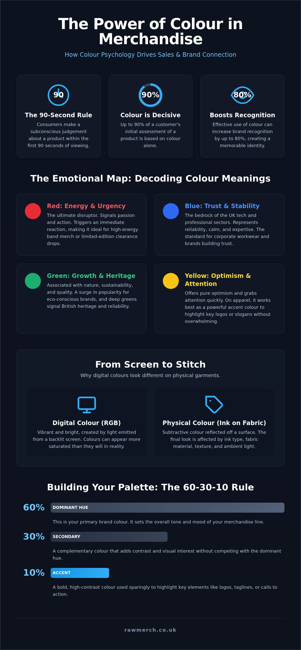
Research indicates that consumers make a subconscious judgement about a product within 90 seconds of their first viewing. Up to 90% of that initial assessment is based on colour alone. This is known as the '90-second rule'. If your custom hoodies don't trigger the right emotional response immediately, you have already lost the potential sale. Effective use of colour can increase brand recognition by up to 80%. This makes it the most powerful tool in your design kit for building a recognisable identity.
There is also the 'Merch Factor' to consider. A colour might look fantastic on a white digital background, but will someone actually wear it as part of their daily outfit? If the shade feels cheap or clashes with common wardrobe choices, your branded gear ends up at the back of a cupboard. Successful merchandise bridges the gap between brand identity and personal style.
The Science Behind Emotional Triggers
Your brain processes visual stimuli almost instantly. This happens long before your logical mind can analyse a design. Some responses are biological; for example, red can physically increase heart rates and create a sense of urgency. Other associations are cultural. In the UK, we often link deep forest greens with heritage, reliability, and the outdoors. Using color psychology in branding allows you to tap into these pre-existing triggers to tell your story faster.
Don't just play it safe. Many brands default to black or navy because they fear making a mistake. While these are reliable, they don't always help you stand out in a crowded market. A bold choice that aligns with your brand values is often more effective than a neutral one that disappears into the background.
Why Merch is the Ultimate Test of Your Brand Palette
Digital branding is fleeting. A user scrolls past a social media post in seconds. Merchandise is different. It is a long-term physical presence. When someone puts on your custom t-shirt, they are 'wearing' your brand. This creates a much deeper psychological connection than a digital interaction. The physical nature of merch also dictates its perceived value. A high-quality garment in a sophisticated palette feels expensive and premium.
At RAW Merch, we've spent 25 years helping UK businesses navigate these choices. We understand that a poorly chosen colour combination can make even the best fabric look low-budget. We ensure your colours don't just look good on a screen; they perform in the real world across different materials and lighting conditions.
The Emotional Map: Decoding Colour Meanings for the UK Market
UK consumers have distinct cultural associations with colour. While global trends matter, the British market responds specifically to heritage, reliability, and understated professionalism. Applying color psychology in branding means understanding these local nuances before you commit to a bulk production run. Your choice of hue determines whether your merch is worn with pride or left in a drawer.
Primary colours form the foundation of most visual identities. In the UK, 'Navy' and 'Racing Green' are more than just design choices; they are signals of stability and quality. These shades tap into a collective sense of British heritage that resonates with local audiences. Understanding how these colours behave in the physical world is vital for creating a professional brand image.
Primary Colours and Their Call to Action
Red is the ultimate disruptor. It signals energy and urgency. This makes it the go-to choice for high-energy band merch or limited-edition clearance drops where you want to trigger an immediate reaction. Blue is the bedrock of the UK tech and professional sectors. It represents stability and trust, which is why it remains the standard for corporate workwear. Yellow offers pure optimism and grabs attention quickly. However, you must use it sparingly in print design. On physical apparel, large blocks of bright yellow can cause visual fatigue. It works best as an accent colour to highlight key logos or slogans without overwhelming the wearer.
The Sophistication of Secondary and Neutral Tones
Green has seen a massive surge in the UK market, particularly for eco-conscious branding and sustainable merchandise. It connects your brand to health and growth. For those aiming for a premium, high-end feel, the combination of Black and Gold is unbeatable. Black signals authority and versatility, while Gold accents add a layer of luxury to custom hoodies and headwear. We have also seen Pink move far beyond old gender stereotypes. It is now a staple for bold, modern lifestyle branding that wants to appear fresh and approachable.
Neutrals provide the necessary balance for any merch collection. Black remains the gold standard for authority, while Grey offers a sophisticated middle ground for everyday lifestyle wear. White signals purity and cleanliness, though it requires high-quality printing to maintain its impact. If you are unsure which shade fits your brand identity, our team can help you select the right clothing printing options to ensure your vision translates perfectly to the fabric. We use our 25 years of experience to ensure your chosen palette works as hard as you do.
From Screen to Stitch: The Reality of Physical Colour in Printing
Your computer screen is a liar. It uses light (RGB) to create vibrant shades that physical ink simply cannot replicate in the same way. If you want to master color psychology in branding, you must understand the technical divide between digital design and physical production. A neon green that glows on your monitor will often look dull on a cotton t-shirt unless you use the specific printing methods required to maintain that punch.
The transition from pixels to thread involves three different colour languages: RGB for screens, CMYK for standard printing, and Pantone for professional accuracy. Most design software defaults to RGB, which has a much wider gamut than the inks used in clothing printing. When we convert your file for production, some of that digital vibrance can be lost. This is why choosing a partner with deep technical knowledge is the only way to protect your brand identity.
The Pantone Matching System (PMS) for Brands
Serious brands don't guess. They use the Pantone Matching System to ensure consistency across every piece of merchandise. This system provides a universal language for colour, allowing us to mix inks that match your brand guidelines exactly. Whether we are producing a single sample or a bulk order of 5,000 units, PMS codes keep your identity intact. To achieve this level of precision, you must provide vector based images. These files allow our team to isolate specific colours and assign the correct ink codes without losing any detail or sharpness.
Substrate Influence: Fabric and Ink Interactions
The material you choose is just as important as the ink. 100% cotton is highly absorbent, which can lead to a softer feel but slightly more muted colours. Polyester blends and synthetic fabrics often keep the ink on the surface, resulting in higher vibrance but a different texture. Texture also changes how light hits the garment. A flat screen print will look different from high-density embroidery, even if they use the same thread and ink codes. The shadows created by the stitches in embroidery can make a colour appear slightly darker than a flat print.
If you are printing light or bright colours on dark garments, you need an underbase. This is a foundational layer of white ink that acts as a primer. Without it, the dark fabric will bleed through the print, turning your vibrant red into a muddy maroon. We specialise in managing these technical hurdles to ensure your color psychology in branding remains effective. We match the right printing method, like Screen Printing or DTF, to your specific design and fabric choice to ensure the final result matches your vision.
Building Your Merch Palette: Practical Strategies for High-Impact Design
Applying color psychology in branding requires more than just picking a mood. You need a practical framework to ensure your palette works on a physical garment. A great starting point is the 60-30-10 rule. In merchandise, this typically means 60% of the visual space is the garment colour, 30% is your primary print colour, and 10% is an accent for highlights or small details. This balance prevents your design from feeling cluttered or overwhelming.
Contrast is non-negotiable. If your logo disappears into the fabric, you've failed. You must ensure there is enough tonal difference between the substrate and the ink. While trend-chasing with 'Colour of the Year' palettes can drive excitement for limited-edition drops, don't sacrifice your core brand identity for a passing fad. This applies to every item in your range, including accessories like custom bobble hats, where multi-coloured yarns can complicate your logo's visibility.
Logo vs. Garment: Avoiding the 'Muddy' Look
Selecting the right garment base is half the battle. Your t-shirt colour should enhance your branding, not compete with it. Heather tones are a secret weapon for many UK brands. The textured grey of a heather garment provides a neutral, high-contrast background that makes almost any logo colour pop. If you're creating call-to-action gear, such as event staff uniforms, use 'pop' colours like safety orange or electric lime. These high-visibility shades ensure your team is instantly recognisable in a crowd.
Industry-Specific Colour Strategies
Different sectors have established psychological 'rules' that you ignore at your peril. For band merchandise, black remains the undisputed king. It fits the lifestyle of the audience and provides the best canvas for detailed tour artwork. Corporate promotional items usually lean towards 'stealth' branding. Sophisticated navy, charcoal, or forest green tones allow employees to wear the gear in professional settings without feeling like a walking billboard. In the retail and fashion space, pastel palettes are currently driving sales for lifestyle-focused apparel. These softer tones feel approachable and modern. If you're ready to build a high-impact range, start your custom merch order with our expert team today.
Execute Your Vision: Professional Colour Management with RAW Merch
Theory is useless without precise execution. You now understand how color psychology in branding influences buyer behaviour, but turning those insights into physical products requires technical mastery. We have over 25 years of industry experience in the UK market. This tenure means we've solved every possible colour-matching challenge. We don't just print garments; we manage your brand identity across every custom t-shirt and hoodie you produce.
Our UK-based production facility ensures total control over the entire process. We guide you from digital proofing to physical execution with a focus on absolute precision. Consistency is our priority. Whether you are ordering 50 units or 5,000, the colour of the first garment must match the last. We provide the reliability you need for complex brand palettes that must remain identical across different materials and printing methods.
Expert Printing Techniques for Every Palette
We match the method to your design requirements to ensure the best results. Our specialists use a range of technical processes:
- Screen Printing: The gold standard for bold, vibrant solids and exact Pantone matching. It provides a durable ink deposit that stands the test of time.
- DTF (Direct to Film): Best for intricate, multi-coloured designs and complex gradients. It allows for high-detail reproduction without compromising on colour depth.
- Sublimation: Ideal for all-over, fade-resistant colour on tech fabrics and sportswear. This method ensures your design stays vibrant even after heavy use.
Start Your Project Today
Success starts with the right preparation. Ensure your files are high-quality vectors to guarantee the sharpest print results. We recommend a professional consultation for large-scale merch runs to ensure your color psychology in branding strategy translates perfectly to the final product. Don't leave your brand's physical presence to chance. Empower your business with merchandise that looks exactly as you intended. Contact our team today to get a quote for your custom project and take the first step toward a professional, high-impact merch range.
Bring Your Brand to Life with Professional Colour
Choosing the right palette is the difference between a garment that sits in a warehouse and one that becomes a customer's favourite staple. You've now learned how to decode the emotional map of the UK market and bridge the gap between digital RGB designs and physical ink. Mastering color psychology in branding ensures your merchandise works as a powerful sales tool that resonates with your audience instantly. Consistency across your range is what separates professional gear from amateur attempts.
Don't let technical hurdles or poor colour matching dilute your vision. We bring 25+ years of UK printing expertise to every project, specialising in high-precision screen printing, DTF, and sublimation. Trusted by bands and brands worldwide, we ensure your identity stays sharp across every material. It's time to turn your creative concepts into tangible, high-quality products that people are proud to wear. GET A QUOTE FOR YOUR CUSTOM MERCH today and start building a range that connects with your fans. Your creative vision deserves a partner who prioritises execution.
Frequently Asked Questions
What is the most effective colour for brand recognition?
Blue is often cited as the most popular for trust, but consistency is actually the most effective driver of recognition. Research suggests that colour can increase brand recognition by up to 80%. Sticking to your core palette across all merchandise creates a unified identity. Using color psychology in branding helps you select a primary hue that resonates with your specific target audience. We ensure your recognition stays high by matching colours exactly across every order.
Why do my brand colours look different on a t-shirt than on my website?
Your monitor uses RGB light to create colours, while printing uses physical ink. This shift from light-based pixels to CMYK or Pantone pigments changes how shades appear. Additionally, fabric absorbs ink differently than a screen displays light. We use our 25 years of experience to manage these technical shifts. We ensure your physical merchandise matches your digital vision as closely as possible by selecting the right ink and substrate for your design.
What is the best colour for band merchandise?
Black is the undisputed king for band merchandise because it aligns with fan lifestyles and provides a high-contrast base for intricate tour artwork. It is a practical choice that hides wear and tear during long tours. While you can experiment with limited drops in 'pop' colours, black remains the safest and most profitable option for bulk merch sales. It fits the aesthetic fans expect and ensures your graphics stand out on any stage.
Can you match a specific Pantone colour in screen printing?
Yes, we specialise in Pantone matching for screen printing to ensure your brand identity remains consistent across all garments. By using the Pantone Matching System (PMS), we mix specific ink formulas to hit your exact brand codes. This level of precision is essential for professional-grade uniforms and corporate promotional items. Colour accuracy is non-negotiable for brand integrity, and our UK-based team handles this with expert care on every bulk production run.
Does the material of the hoodie affect the print colour?
Fabric composition significantly impacts the final look of your print. 100% cotton garments are highly absorbent, which can lead to slightly more muted tones compared to polyester blends. Synthetic fabrics often hold the ink on the surface for higher vibrance. We adjust our printing methods, such as using white underbases on dark fabrics, to ensure your chosen palette stays bright. Our technical specialists match the ink to the material for the best results.
How many colours should I use in my merchandise design?
We recommend sticking to a palette of one to three colours for the best impact and cost-efficiency. Using a limited palette ensures your design remains clean and recognisable from a distance. It also simplifies the printing process, whether you are using screen printing or DTF. Following the 60-30-10 rule helps balance your garment base with your primary and accent print colours. This strategy creates a professional look that people actually want to wear.
Is there a difference in colour psychology between the UK and the US?
Cultural nuances play a major role in how audiences perceive colour. In the UK, heritage colours like Racing Green or Navy signal reliability and quality more strongly than in the US market. Applying color psychology in branding for a UK audience requires an understanding of these local associations. British consumers often prefer understated, sophisticated tones over high-contrast palettes. We help you navigate these local preferences to ensure your merchandise connects emotionally with UK fans.
Which colours make a brand look more expensive or premium?
Black and Gold or deep Navy and Silver are classic combinations that signal luxury and authority. These high-contrast pairings create a sophisticated aesthetic that increases the perceived value of your custom hoodies or headwear. Neutral tones like charcoal grey or cream also suggest a premium, lifestyle-focused brand. Avoid overly bright or neon shades if your goal is to position your merchandise as a high-end product. Deep, subtle colours always look more expensive on fabric.