

Your monitor is lying to you. That neon electric blue glowing on your screen doesn't exist in the world of physical ink, and assuming it does is the fastest way to ruin a bulk order of custom hoodies. It's a common trap. You spend hours perfecting a design, hit "order," and end up with dull, muddy colours that look nothing like your original vision. Understanding the technical battle of cmyk vs rgb for t-shirt printing is the only way to guarantee your brand looks professional every single time.
We know how frustrating it is to deal with "off" colours and costly re-prints. At RAW Merch, we've seen every file error in the book over our 25 years in the industry. This guide promises to clear the confusion. You'll learn exactly how to set up your artwork colour modes to ensure your custom t-shirts stay vibrant. We'll cover the essential software settings for Photoshop and Illustrator, explain why the "secret sauce" lies in matching your mode to the printing method, and give you the confidence to send your files to the press without second-guessing the result.
Key Takeaways
- Master the technical shift between cmyk vs rgb for t-shirt printing to stop your vibrant screen designs from turning dull on fabric.
- Identify "out of gamut" colours early to prevent bright digital shades from becoming muddy or greyish in production.
- Follow a professional setup checklist including 300 DPI resolution and CMYK mode for guaranteed print accuracy.
- Select the correct file formats like AI, EPS, or high-res PDF to ensure your artwork is ready for the press.
- Rely on our 25 years of industry experience to check your files for colour issues before they hit the print line.
RGB vs CMYK: Why Your T-Shirt Design Looks Different on Screen
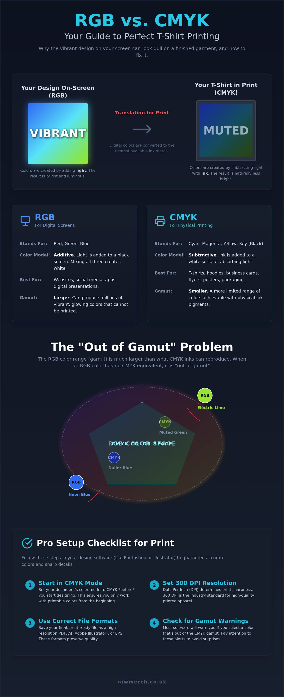
Your screen is a light source; your t-shirt is a physical object. This simple fact is why so many custom clothing orders end in disappointment. To get pro-level results, you must understand the technical divide of cmyk vs rgb for t-shirt printing. RGB (Red, Green, Blue) is the language of digital screens. It's an additive process where light is projected directly at your eyes. CMYK (Cyan, Magenta, Yellow, and Black) is the language of ink. It's a subtractive process where layers of pigment are applied to a surface to absorb light.
The CMYK color model works by masking colours on a light, usually white, background. The ink reduces the light that would otherwise be reflected. The "K" stands for "Key" because black is the master plate used to add depth and detail that the other three colours can't achieve alone. This fundamental difference means your monitor can display a range of colours that physical ink cannot replicate. If you expect your t-shirt to glow like your iPad, you're chasing a myth. "What You See Is What You Get" simply doesn't apply to professional printing without the right file setup.
The Science of Additive vs Subtractive Colour
RGB builds colour by adding light to a black screen. If you turn all three colours to full power, you get pure white. It's perfect for the web but useless for a printing press. CMYK does the exact opposite. It adds physical pigment to a white substrate, like a cotton t-shirt. The more ink you add, the darker the result becomes. This creates a "vibrancy gap." Screens have a much wider colour gamut than ink. When you move from a light-emitting screen to a light-reflecting fabric, you naturally lose some of that digital punch.
The Most Common Mistake: Designing in the Wrong Mode
Most designers start their project in RGB because it offers the brightest, most saturated options. This is a major trap. Starting in RGB sets you up for the "Neon Trap" where you choose an electric lime or a piercing cyan that looks incredible on your LED monitor. However, those specific wavelengths of light don't exist in standard printing inks. When you finally convert that file for production, the software forces those "out of gamut" colours into the nearest CMYK match. The result is usually a muddy, flat version of your original vision.
Mastering the technical divide of cmyk vs rgb for t-shirt printing is the only way to avoid these expensive mistakes. While knowing what is a vector based image is vital for sharpness, setting the correct colour mode is what keeps your brand looking professional. Don't wait until the proofing stage to find out your colours are impossible to print. Our team has spent 25 years helping clients bridge this gap, ensuring the final product matches the creative vision without the "muddy" surprises.
The Technical Breakdown: RGB and CMYK Comparison
Choosing the right colour mode isn't just a design preference. It's a technical requirement for production. RGB files are typically smaller and easier to manage because they only process three channels of light data. CMYK files are larger; they carry the specific data needed for four physical ink plates. While RGB is perfect for your website or social media, it's useless for a printing press. You need that extra data to tell the machinery exactly how much ink to deposit on the fabric.
Most modern design software tries to bridge this gap by simulating CMYK on your RGB monitor. This is essentially a digital guess of a physical reality. Your screen uses glowing pixels to "fake" the look of matte ink. It's a helpful preview, but it isn't foolproof. This is where the technical understanding of cmyk vs rgb for t-shirt printing becomes your best tool for avoiding expensive mistakes.
Colour Gamut: The Range of Possibilities
Gamut is the spectrum of colours available within a specific colour model. The RGB gamut is significantly larger than the CMYK gamut because it uses light to create colour. It can produce vibrant neons and deep electric purples that physical pigments simply cannot match. CMYK is limited by the chemistry of ink and the way cotton or polyester absorbs those pigments. When you design in RGB, you're working in a playground that is physically larger than the one the printer can use. Understanding these limits early prevents the frustration of "dull" results during the proofing stage.
Why CMYK is the Standard for Custom T-Shirts
Professional UK print houses rely on CMYK to achieve consistent, repeatable results. When we prepare a run of custom t-shirts, we mix four primary inks to create thousands of different shades. This subtractive process ensures that the colours you've selected are translated accurately onto the garment. The "K" in CMYK stands for "Key," and it's the most important part of the mix. Black ink provides the depth, contrast, and sharp detail that Cyan, Magenta, and Yellow cannot produce on their own. Without a strong black plate, your artwork will look washed out and lack professional punch.
At RAW Merch, we've spent 25 years perfecting this process for major bands and corporate clients. We know that vibrant colours are non-negotiable for high-quality merch. If you're feeling unsure about your file settings, you can always reach out to the experts at RAW Merch for a pre-flight check. We'll make sure your cmyk vs rgb for t-shirt printing setup is correct before we start the production line, saving you time and ensuring a pro-level finish.
The "Out of Gamut" Nightmare: Why Neon RGB Fails in Print
Your screen is writing cheques your printer can't cash. When you pick a vibrant, glowing neon on your monitor, you're often stepping "out of gamut." This technical term describes any colour that exists in the digital RGB spectrum but cannot be reproduced using the four-colour CMYK ink process. If you ignore the rules of cmyk vs rgb for t-shirt printing, your electric blues and lime greens will undergo a "colour collapse." The software will force those impossible shades into the nearest printable match, usually resulting in a muddy, flat, or greyish finish that lacks any of the original energy.
The garment colour itself complicates this further. Printing on a white shirt is straightforward; the fabric acts as a bright, reflective base. However, printing on black or dark garments requires a white "underbase" of ink first. This extra layer is essential for visibility, but it can make "out of gamut" colours look even more muted if the artwork isn't handled by a specialist. At RAW Merch, we've spent 25 years helping clients navigate these hurdles to ensure their designs don't lose their punch during production.
Spot Colours vs Process Colours
Process colours (CMYK) use thousands of tiny dots to build an image. This is the standard for photos or complex, multi-coloured illustrations. However, when you're creating band merchandise, a standard CMYK mix might not be enough for a specific, high-impact logo. This is where Spot Colours, often using the Pantone Matching System, become the hero. These are pre-mixed, solid inks that can achieve vibrancies CMYK simply can't touch. We use these specific inks to guarantee your brand colours remain consistent and loud across every single shirt in the run.
How Printing Methods Handle Colour
Your choice of printing method is the "secret sauce" that determines how your colours actually land. Screen Printing remains the gold standard for solid, vibrant results because it allows us to use thick layers of Spot colour or high-pigment CMYK. If your design has complex gradients or dozens of colours, Direct to Film (DTF) is the modern solution. DTF tech bridges the gap by allowing for high-detail, multi-colour prints that still maintain professional durability. For those working with white polyester, Sublimation offers the broadest colour range. Because the ink bonds directly with the fibres as a gas, it can replicate a slightly wider gamut than traditional surface inks, getting you closer to that "on-screen" look. Understanding cmyk vs rgb for t-shirt printing within the context of these methods is what separates amateur merch from pro-level gear.
Pro Setup: How to Prepare Your Artwork for T-Shirt Printing
Preparation is the difference between a pro-level garment and a costly mistake. You've already learned the theory behind cmyk vs rgb for t-shirt printing; now it's time to apply those rules to your workspace. Before you even think about hitting "save," you must verify your file's foundation. Every professional print file requires three non-negotiable elements: CMYK colour mode, a resolution of at least 300 DPI, and dimensions set to the actual intended print size. Don't send a small web graphic and expect a miracle on a hoodie. It won't happen.
The file format you choose dictates the final clarity. Vector files, such as AI and EPS, are the gold standard because they allow for infinite scaling without pixelation. If you're working with raster images, a high-resolution PDF or TIFF is your best bet. Watch out for "flattening" your layers too early. If your design uses transparency effects or specific RGB blending modes, these can shift unexpectedly when compressed into a CMYK file. Always check your "Rich Black" settings too. A simple 100% K black often looks like dark grey charcoal on a t-shirt. For a deep, obsidian finish, use a mix like 60% Cyan, 40% Magenta, 40% Yellow, and 100% Black.
Setting Up Your File in Adobe Illustrator
- Step 1: Navigate to File > Document Color Mode > CMYK Color. This ensures every element you create starts in the correct workspace.
- Step 2: Open your Swatches panel. Delete any RGB-only presets to avoid accidentally using colours that your printer can't replicate.
- Step 3: Export your final design as a vector PDF or EPS. This keeps your lines crisp and your colours locked in for the press.
Setting Up Your File in Adobe Photoshop
- Step 1: Go to Image > Mode > CMYK Color. It's best to do this conversion after you've finished your initial creative work to maintain editing flexibility.
- Step 2: Use the "View > Gamut Warning" tool. This highlight's any "illegal" colours that are too bright for physical ink, allowing you to fix them before production.
- Step 3: Save your work as a high-resolution TIFF or PSD. Ensure you maintain transparent backgrounds so we can easily place your art on any garment colour.
Getting these technical details right is the only way to guarantee a result you'll be proud to wear. If you're still worried about your settings, you can request a file review from RAW Merch. We've spent 25 years catching these errors before they reach the press, and we'll make sure your cmyk vs rgb for t-shirt printing setup is flawless before we start your order.
Get Pro-Level Merch with RAW Merch’s Expert Printing
Understanding the theory of cmyk vs rgb for t-shirt printing is only half the battle. The other half is execution. You need a partner who doesn't just take your money and hit "print" on a flawed file. At RAW Merch, we operate a strict "Pre-Flight" process. Our experts review your artwork before it reaches the production floor. If we spot an "out of gamut" neon or a resolution issue that will result in a blurry print, we flag it. We ensure your creative vision translates perfectly to the fabric every single time. We don't leave your brand's reputation to chance.
Our UK-based facility is built for speed and reliability. We handle everything from high-volume corporate uniforms to limited-edition tour merch. Because we control the entire process in-house, we maintain total quality control. You won't have to worry about muddy colours or peeling prints. We deliver retail-quality results that stand up to the rigours of the road or the daily grind. This is about more than just ink on a shirt; it's about providing a product you're proud to sell.
Why 25 Years of Experience Matters
We've spent over two decades in the game. We've seen every possible file error, from RGB-only exports to low-res web scraps. That experience allows us to choose the best production method for your specific design. Whether it's the vibrant, solid punch of Screen Printing or the intricate, multi-colour detail of DTF, we match the tech to the art. This expertise is why major touring bands and international brands trust us. We don't just print shirts; we manage logistical punctuality to ensure your merch is exactly where it needs to be, exactly when you need it.
Ready to Print? Let’s Get Started
Stop guessing and start printing with confidence. Whether you need a quick quote for a bulk order or a design consultation to bridge the gap between cmyk vs rgb for t-shirt printing, our team is ready to help. We also offer comprehensive fulfillment and distribution services. This means we can handle the storage and shipping of your merch, leaving you free to focus on your business or your music. Don't settle for "good enough" when you can have pro-level results from a team that actually cares about the finish.
START YOUR CUSTOM MERCH ORDER TODAY
MASTER YOUR COLOUR AND PRINT WITH CONFIDENCE
You now have the technical blueprint to bridge the gap between digital design and physical reality. By mastering the shift from cmyk vs rgb for t-shirt printing, you've eliminated the risk of dull, muddy results. Remember to always design within the limits of physical ink and use the "Gamut Warning" tools to spot trouble before it hits the press. High-quality merch isn't an accident; it's the result of precise file preparation and choosing the right production method for your specific artwork.
At RAW Merch, we bring over 25 years of UK printing expertise to every order. Whether you need the vibrant punch of screen printing, the detail of DTF, or the durability of sublimation, we have the specialized tech to make it happen. We're the trusted partner for bands and businesses across the UK who refuse to compromise on quality. Our team checks your files so you don't have to worry about the frustration of costly re-prints.
GET A QUICK QUOTE FOR YOUR CUSTOM PRINTING
Your creative vision deserves to be seen in full, vibrant colour. Let's get your next project on the press today.
Frequently Asked Questions
Can I print a t-shirt from an RGB file?
You can technically send an RGB file, but it isn't recommended for professional results. Most printing software will automatically convert your file to CMYK, which often leads to unexpected and dull colour shifts. By converting the file yourself before submission, you maintain total control over the final appearance. This prevents the muddy look that happens when bright digital pixels are forced into a physical ink spectrum without manual adjustment.
Why does my design look duller when printed on a black t-shirt?
Black fabric absorbs light rather than reflecting it, which naturally reduces the perceived vibrancy of your design. We use a white ink underbase to help colours pop on dark garments, but it still won't match the back-lit glow of your monitor. The contrast between the ink and the dark cotton creates a different visual dynamic than a white screen. Proper file setup for cmyk vs rgb for t-shirt printing helps mitigate this dullness.
What is the best file format for t-shirt printing?
Vector formats like AI and EPS are the gold standard because they offer infinite scalability without losing sharpness. If you are working with photographic or complex raster art, a high-resolution PDF or TIFF at 300 DPI is essential. These formats preserve the specific CMYK colour data and transparent backgrounds we need for a clean finish. Avoid low-quality JPEGs or PNGs from the web, as they lack the data required for professional garment production.
Will my neon green logo look the same on a t-shirt?
Standard CMYK inks cannot replicate the electric glow of a neon green RGB logo. Those out of gamut shades will typically print as a flatter, more muted forest or grass green. If your brand relies on a specific neon punch, we recommend using a Pantone Spot colour. These pre-mixed inks are designed to achieve vibrancies that four-colour process printing simply cannot reach, ensuring your logo stands out exactly as intended on every shirt.
Do I need to use Pantone colours for my band merch?
You don't always need Pantone colours for band merch, especially for photographic designs or complex illustrations. Standard CMYK is cost-effective and handles most artwork beautifully. However, if your band has a specific signature colour that must be identical across every tour shirt and hoodie, Pantone is the solution. It provides a level of consistency and vibrancy that process printing can't always guarantee, particularly for bright or very specific brand shades across large runs.
What is "Rich Black" and should I use it for my design?
Rich Black is a mixture of Cyan, Magenta, Yellow, and Black inks used to create a deeper, darker finish than 100% Black alone. On fabric, 100% K often looks like a very dark charcoal grey. By adding small percentages of the other three colours, you get an obsidian-level black that looks professional. We typically recommend a mix like 60% Cyan, 40% Magenta, 40% Yellow, and 100% Black for large areas of black in your designs.
Can RAW Merch convert my RGB file to CMYK for me?
We can handle the conversion, but we always suggest you do it during the design phase to avoid surprises. As part of our Pre-Flight process, our team checks every file for major colour issues before production begins. If your cmyk vs rgb for t-shirt printing setup looks like it will cause problems, we'll flag it. This collaborative approach is why we've been trusted by UK bands and businesses for over 25 years to deliver quality.
How does DTF printing handle complex RGB-style gradients?
Direct to Film (DTF) printing is exceptionally good at handling complex gradients and fine details that traditional screen printing might struggle with. While it still operates within a CMYK framework, the technology allows for smoother transitions and a slightly broader perceived colour range. It's the perfect choice for designs that feature digital-style glows or intricate shading, providing a high-end finish that bridges the gap between your screen and the final physical garment.