

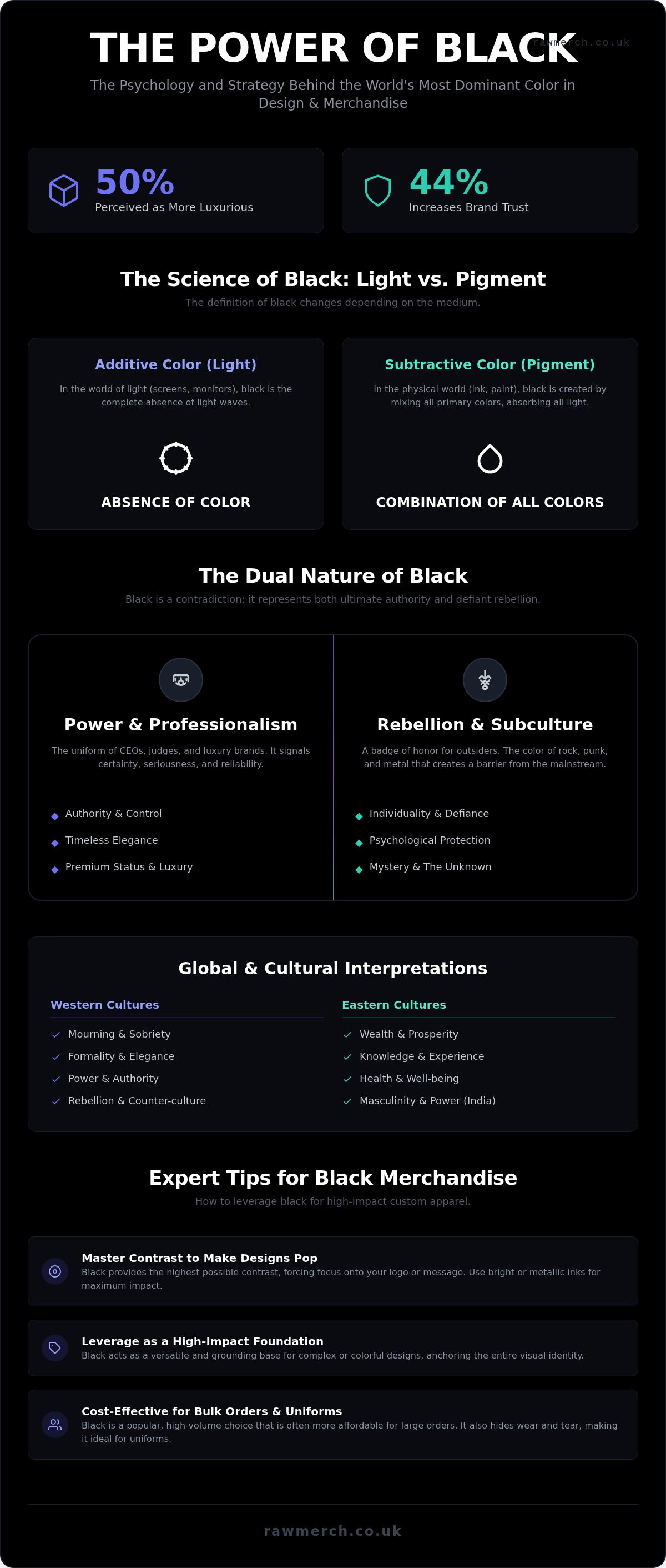
Did you know that 44% of consumers say the color black increases brand trust? It is the second most trusted color on the planet, sitting right behind blue. Despite this, many creators still worry that black is too boring or carries too much negative baggage. Understanding the black color meaning is about more than just picking a shade. It is about harnessing a tool that 50% of people perceive as more luxurious than any other option.
If you've ever struggled to make your dark designs pop or felt stuck in the "is black a colour?" debate, you aren't alone. We know that black is far from basic. It is a tactical choice for authority, timelessness, and professional impact. You will discover the deep psychological triggers of black and learn how to use this powerful colour to create high-impact custom merchandise. We are going to show you how to move past the "boring" label and provide practical tips for printing black merch that stands out in any crowd.
Key Takeaways
- Master the psychological triggers of authority and mystery that define the black color meaning to command attention.
- Discover why black is the most trusted choice for custom hoodies and t-shirts, outperforming almost every other shade in brand perception.
- Navigate the cultural symbolism of black to ensure your merchandise resonates across both Western and Eastern markets.
- Get professional design tips for selecting the right base garments and printing methods to make your dark designs pop.
- Learn how to use black as a cost-effective, high-impact foundation for bulk orders and professional uniforms.
What Does the Colour Black Mean? The Psychology of Darkness
Black is the ultimate power move in design. It isn't just a choice; it's a statement of absolute certainty. Scientifically, black occurs when an object absorbs all wavelengths of visible light. It is the total absence of reflection. This physical reality translates directly into a heavy psychological impact. When you look at black, your brain registers a lack of visual noise. This creates an immediate sense of authority and mystery. It is the ultimate "void" in the visual world. By using black, you force the viewer to ignore the background and focus entirely on your primary message or logo. This makes it the most versatile base for any brand that wants to command respect without saying a word.
Think of black as a blank slate with weight. It provides the highest possible contrast for any other colour or texture you place on top of it. We have spent over 25 years seeing how this "absence" actually fills a room. It grounds a visual identity and gives it a foundation that feels permanent. Whether you are building a brand from scratch or refreshing a classic look, understanding the black color meaning is your first step toward total design control.
Is Black Actually a Colour?
Stop overthinking the "is it a colour" debate and look at the science. The answer depends on whether you are talking about light or pigment. In additive colour theory, which involves light, black is the total absence of colour. In subtractive colour theory, used in pigment and ink, black is the combination of all colours. For our production team, black is the most critical tool in the kit. It is the foundation of almost every high-volume garment order we process. Black is a physical absence of light that creates a powerful psychological presence. It is the anchor that holds a complex design together. Researching the symbolism of the color black reveals why it remains the backbone of the global merchandise industry.
The Emotional Weight of Black
Black acts as a psychological shield. It provides a sense of security and protection by hiding vulnerabilities and creating a barrier. This is exactly why it is the default choice for uniforms, high-stakes branding, and security gear. It also taps into "the unknown," which naturally builds intrigue and curiosity. People are drawn to what they cannot fully see. However, you must use it with precision. If you don't balance it with enough negative space or contrasting highlights, black can feel heavy or overwhelming. It can swallow your design if you don't respect the nuance of the black color meaning. Use it to ground your creative vision, but don't let it drown your message. Balance is the key to authority.
The Dual Nature of Black Symbolism: From Power to Rebellion
Black is the ultimate contradiction. It represents the highest levels of authority and the deepest roots of rebellion. While the scientific "void" we discussed earlier provides the canvas, symbolism provides the soul. Understanding the black color meaning requires looking at how it shifted from a sign of mourning to a badge of high-fashion elegance and eventually a symbol of underground defiance. It is a tool of transformation. In one context, it signals a "no-nonsense" CEO; in another, it marks the lead singer of a metal band. This duality is exactly why it remains the most requested base for custom apparel year after year.
Black in Professional Contexts
In the boardroom, black is about total certainty. It conveys a premium status without the need for flashy accents. High-end luxury brands rely on this perception. In fact, research shows that logos in the color black are perceived as 50% more luxurious than logos in other colors. It establishes a clear hierarchy. When you see a judge, a priest, or a security professional in black, you recognize their role instantly. It signals reliability and seriousness. This is why 44% of consumers say that black increases brand trust. It is the second most trusted color globally, making it a safe but powerful bet for your corporate identity.
The 'Cool' Factor: Black in Music and Subculture
This is where black becomes a uniform for the outsiders. While high fashion uses black for elegance, subcultures like rock, punk, and metal reclaimed it as a badge of honour. It is the color of the underground. The psychology of color suggests that wearing black can provide a sense of protection and "outsider" status. It creates a barrier between the wearer and the mainstream world. From a design perspective, black garments simplify the aesthetic. They strip away the noise. This forces the viewer to focus entirely on the message, the artwork, or the band logo. It is the most effective way to make a graphic pop.
Whether you are designing for a corporate office or a world tour, black provides the versatility you need. It hides wear and tear while maintaining a sharp, professional edge. It is the only "colour" that truly looks good on everyone, regardless of the setting. If you are ready to build your own brand uniform or tour range, our clothing printing specialists can help you select the perfect garments to bring your vision to life. Don't settle for a boring design when you can harness the most powerful tool in the visual kit. The black color meaning is rooted in strength; use that strength to your advantage.
Why Black Dominates Branding and Merchandise
Black is the undisputed king of the warehouse. It is the most requested garment colour for a reason. While trends in neon or pastel shades come and go, black remains the permanent foundation of the merchandise industry. It offers a level of versatility that no other shade can match. Whether you are ordering a small batch of premium hoodies or a massive run of promotional items, black is the safest and most effective choice you can make. It isn't just about the aesthetic; it is about the physical reality of how garments are used and worn in the real world.
Durability is a massive factor for our clients. Touring is a grind, and workwear is even harder. Black garments hide the sweat, the stains, and the miles better than any lighter alternative. This practical edge means your customers get more value from every purchase. They will wear a black t-shirt for years, whereas a white one might be retired after a single spill. When you consider the black color meaning in a commercial sense, it represents longevity and reliability. It is an investment that keeps your brand visible for longer.
This focus on long-lasting utility is why black is also the standard for children's school gear; for instance, you can discover Crabkids London for exceptionally durable school shoes that maintain their professional look through daily use.
High contrast is another major win for designers. A black base provides the perfect canvas for white, gold, or neon inks to truly pop. You don't have to worry about clashing tones or muddy results. Because manufacturers produce more black blanks than any other colour, they are also the most accessible for large-scale orders. This logistical consistency ensures that your bulk runs are delivered on time without the headaches of "out of stock" notifications for niche colours.
The Standard for Band Merchandise
The black band tee is a global cultural icon. It is the official uniform of the music industry. Fans prefer black because it fits the "outsider" aesthetic we discussed earlier, but also because of its sheer staying power. A black garment simplifies the look so your artwork takes centre stage. If you want to dive deeper into tour essentials, check out our comprehensive band merchandise guide. We have spent decades helping artists turn their vision into wearable art that stands the test of time.
Black in Luxury Branding
Exclusivity is often wrapped in black. From high-end "Black Cards" to minimalist packaging, this shade signals premium quality without trying too hard. When you use black for your brand's apparel, you immediately elevate the perceived value. A simple logo embroidered in silver or gold thread on a black hoodie feels significantly more expensive than the same design on a bright red base. It is the "less is more" philosophy in action. By tapping into the black color meaning of sophistication, you position your brand as a leader rather than a follower.
Global and Cultural Interpretations of Black
Black doesn't mean the same thing in London as it does in Tokyo. In Western cultures, black has long been the color of mourning and high-stakes formality. However, the black color meaning changes significantly when you cross borders. In many Eastern cultures, it symbolizes wealth and prosperity. Some African traditions view black as a mark of maturity and wisdom. Even in Ancient Egypt, it was associated with fertility and the life-giving soil of the Nile. You must understand these nuances if you want your merchandise to resonate on a global scale. Cultural context is the difference between a design that feels "cool" and one that feels "meaningful."
Middle Eastern perspectives often link black to spiritual depth and modesty. It is a color of rebirth. This global variety proves that black is never a one-dimensional choice. It is a vessel for whatever meaning your brand or culture pours into it. If you are targeting a diverse demographic, black is the most adaptable choice in your design kit. It bridges the gap between different traditions while maintaining a consistent professional edge. It is a safe bet for international shipping because it carries a sense of weight and importance in almost every corner of the world.
Black in Feng Shui and Design
Black represents the water element in Feng Shui. It is used to ground a space and provide visual stability. Think of it as the "Yin" to the "Yang" of white or brighter tones. In branding, black works best when used to anchor a layout. It prevents a design from feeling too flighty or unorganized. Use it on the borders or as the primary text color to create a sense of calm authority. When you use black to ground your visual identity, you tell your audience that your brand is stable and reliable. It is about creating a sense of balance that feels natural to the eye.
The Shift Toward Gender-Neutral Branding
One of the most powerful shifts in the 2020s is the move toward gender-neutral branding. Black is the ultimate "unisex" choice for custom clothing. It breaks away from the tired blue and pink binaries that used to dominate the market. For modern brands, black offers a path to a more inclusive identity. It doesn't matter who is wearing the garment; black looks professional and stylish on everyone. This universal appeal makes it the perfect base for bulk orders where you need to cater to a wide range of people. It simplifies your inventory and ensures that everyone feels comfortable in your gear.
We have seen brands grow by simply simplifying their color palette to focus on what works across all demographics. If you want to create an inclusive, global brand, start with the most versatile foundation available. Our team can handle your custom T-Shirts & Hoodies orders with the precision that 25 years of experience provides. We ensure your designs look sharp and professional on every continent. Order your gear today and build a brand that speaks to everyone.
Expert Tips for Designing Black Custom Merch
Not all black t-shirts are created equal. When you look at different manufacturers, you will see "Deep Black," "Vintage Black," and "Jet Black." These aren't just names. They represent different dye processes and fabric weights. Choosing the right base is the first step in mastering the black color meaning for your brand. If you want a crisp, modern look, go for a high-density jet black. If you want a streetwear vibe, a slightly washed vintage black works better; you can learn more about Memento Mori Clothing to see how this aesthetic is executed in high-quality apparel. We help you navigate these choices because we've handled thousands of bulk orders over the last 25 years.
Your print method matters just as much as the fabric. For large screen printing runs, we use a high-opacity white underbase to ensure your colours stay vibrant. Without it, the black fabric will "soak up" your ink, leaving you with a dull, muddy design. If your artwork has complex gradients or photographic detail, DTF (Direct to Film) is the way to go. It sits on top of the fibers and maintains total clarity. For a truly high-end effect, try the "Black on Black" look. By using gloss inks on a matte black fabric, you create a subtle, tonal texture that screams luxury. It is a sophisticated way to use the black color meaning without shouting for attention.
Technical precision starts with your files. Clean lines are non-negotiable on dark shirts. This is exactly what is a vector based image and why it is essential for your production. Vectors allow us to scale your artwork without losing the razor-sharp edges that make black merch look professional. We don't guess with your designs; we ensure they are production-ready from day one.
Avoiding the 'Heavy' Look
Don't let your design become a "plastic sheet" on someone's chest. Large, solid blocks of ink can feel heavy and uncomfortable. Use negative space to your advantage. Let the black fabric breathe through the design. This makes the garment more wearable and often looks more intentional. If you want to add energy, balance the black with vibrant accent colours like Cyan, Pink, or Yellow. These high-visibility tones create a massive visual impact against a dark background while keeping the overall aesthetic grounded.
Reliability in Production
White ink on black fabric is notoriously difficult to get right. If it isn't cured properly, it will crack or fade after a few washes. Our 25 years of industry experience means we've perfected the curing process to ensure your merch stays looking fresh. We prioritize execution and scheduling so you get quality results every time. If you are looking for winter-ready options, check out our custom bobble hats for a tactical, blacked-out accessory that complements any range. Trust the experts to handle the technical details while you focus on the creative vision.
MASTER THE DARKNESS FOR YOUR BRAND
Black is more than a simple design choice. It is a strategic anchor for authority, trust, and timeless style. You've seen how the black color meaning shifts across cultures and why it remains the gold standard for global merchandise. From the physical "void" of pure science to the rebellion of the underground, black provides a foundation that no other shade can match. It is durable, practical, and carries a perceived value that elevates any logo or message.
Success in merchandise printing comes down to the technical details. You now know why selecting the right base and the correct curing process is vital for a professional finish. With over 25 years of UK printing expertise, we are specialists in bulk screen printing and DTF. We are trusted by bands and businesses nationwide to deliver results that don't fade. Ready to create high-impact black merch? Get a quick quote from RAW Merch today! We are here to bring your creative vision to life with the precision your brand deserves. Let's get to work.
Frequently Asked Questions
What does the colour black represent in psychology?
Black represents authority, power, and total certainty in psychology. It creates a "shield" effect that hides vulnerabilities and provides an immediate sense of security. Because it absorbs all light, it also taps into the mystery of the unknown. This makes it a tool for brands that want to project a no-nonsense, premium image without relying on flashy visual distractions. It is the ultimate anchor for any professional visual identity.
Is black a good colour for my business logo?
Black is an excellent choice for a business logo because it signals reliability and luxury. A survey of 1,000 consumers in March 2025 found that 44% of people say black increases brand trust. It is also perceived as 50% more luxurious than logos in other colours. If you want to convey "premium" status and timelessness, black is a safe and effective foundation for your brand.
Why is black so popular in the fashion and merchandise industry?
Black dominates the merchandise industry because of its unmatched durability and practicality. It hides stains, sweat, and wear better than any other shade, which is why it is the default choice for workwear and touring. From a production standpoint, black blanks are the most accessible for large runs. This logistical consistency makes it the most cost-effective and reliable option for bulk garment orders.
Does the colour black have negative meanings?
Yes, the colour black has a dual nature and can represent mourning, grief, and fear. In many Western cultures, it is the traditional colour for funerals and the occult. However, the modern black color meaning has evolved to include elegance and rebellion. The key is balance. Using too much black without enough negative space can feel overwhelming, so design contrast is essential to keep the mood professional.
What colours go best with black in design?
High-contrast colours like white, gold, and vibrant neons go best with black. Because black is a neutral "void," it forces the viewer to focus entirely on the accent colours. Yellow, Pink, and Cyan are particularly effective for making a logo "pop" on a dark base. Using metallic inks like silver or gold on a matte black garment can also create a sophisticated, premium look that feels expensive and intentional.
Is black technically a colour or the absence of colour?
Black is technically the absence of visible light in physics, but it is a combination of all pigments in the world of printing. In our production facility, we treat it as the most important tool in the kit. It acts as the anchor for every design. Whether you view it as a physical absence or a psychological presence, it remains the most powerful visual tool for creating high-impact merchandise.
Why do bands always choose black for their merchandise?
Bands choose black because it is a global cultural icon that represents "outsider" status and rebellion. It simplifies the aesthetic, ensuring that the band logo or artwork remains the primary focus. Beyond the "cool" factor, it is a practical choice for life on the road. Black tees hide the grime of touring and stay looking sharp for fans long after the show is over. It is the official uniform of the music world.
Can black be used in Feng Shui for branding?
Black is used in Feng Shui to represent the water element and to ground a design layout. It provides visual stability and acts as a "Yin" balance to brighter "Yang" elements. When used correctly in branding, it creates a sense of calm authority and permanence. It prevents a visual identity from feeling scattered, telling your audience that your business is grounded, stable, and reliable. Understanding the black color meaning helps you use this grounding effect to your advantage.